vivid: Variable Importance and Variable Interaction Displays
vividVignette.RmdIntroduction
Introduction to vivid
![]()
Variable importance (VImp), variable interaction measures (VInt) and
partial dependence plots (PDPs) are important summaries in the
interpretation of statistical and machine learning models. In this
vignette we describe new visualization techniques for exploring these
model summaries. We construct heatmap and graph-based displays showing
variable importance and interaction jointly, which are carefully
designed to highlight important aspects of the fit. We describe a new
matrix-type layout showing all single and bivariate partial dependence
plots, and an alternative layout based on graph Eulerians focusing on
key subsets. Our new visualisations are model-agnostic and are
applicable to regression and classification supervised learning
settings. They enhance interpretation even in situations where the
number of variables is large and the interaction structure complex. Our
R package vivid (variable importance and variable
interaction displays) provides an implementation. When referring to VImp
and VInt together, we use the shorthand VIVI. For more information
related to visualising variable importance and interactions in machine
learning models see our published work[1].
Install instructions
Some of the plots used by vivid are built upon the
zenplots package which requires the graph
package from BioConductor. To install the graph and
zenplots packages use:
if (!requireNamespace("graph", quietly = TRUE)){
install.packages("BiocManager")
BiocManager::install("graph")} install.packages("zenplots")
Now we can install vivid by using:
install.packages("vivid")
Alternatively you can install the latest development version of the package in R with the commands:
if(!require(remotes)) install.packages('remotes')
remotes::install_github('AlanInglis/vividPackage')
We then load the vivid package via:
Background
VIVI metrics can be categorized into two types: those that are
model-specific (embedded) and those that are model-agnostic. Here we
provide a brief background on variable importance, variable
interactions, and partial dependence and discuss their use in
vivid.
Variable Importance
The importance value of a variable measures the extent to which it impacts the model’s output. Embedded methods weave variable importance directly into the machine learning algorithm. For instance, machine learning methods like random forests (RF)[2] and gradient boosting machines (GBM)[3] utilize their tree-based architecture to evaluate the performance of the model. Similarly, Bayesian additive regression tree models (BART)[4] adopt an embedded approach to yield VIVI metrics by measuring the proportion of splitting rules for for individual or paired variables in the trees.
The package randomForestExplainer[5] offers a toolkit
for deciphering the inner workings of a random forest. It applies the
minimal depth concept[6] to gauge both the significance and interaction
strength by observing a variable’s location within the trees. Moreover,
the varImp package[7] facilitates the computation of
importance scores for the party package’s conditional
inference random forest[8]. For gradient boosted machines, the
EIX[9] package can be used to calculate VIVI, and
graphically represent the findings.
Model-agnostic techniques are universally applicable to any ML
algorithm. These methods offer flexibility in model choice and are
valuable for comparing various ML models. Permutation importance[2], a
model-agnostic method, assesses VImps by computing the change in a
model’s predictive accuracy after permuting a variable. This approach is
available in the iml[10], flashlight[11],
DALEX[12], and vip[13] packages.
In vivid we provide the functionality to calculate
either an agnostic or model-specific importance.
- To calculate agnostic importance,
vividuses a permutation approach[14]. In this approach, the model’s error score (e.g., root mean square error) is first determined. Afterward, each feature is randomly permuted, and the error score is computed again. The change in performance indicates the importance score of that particular feature. The permutation algorithm can be described in the following:
Permutation Importance Algorithm:
Input: Fitted predicted model \(m\), dataset \(D\)
Compute: Compute error score \(w_{k}\) of the fitted model \(m\) on data \(D\).
For each feature \(k\) (column of \(D\))
- For each repetition \(r\) in \(1,...,R\):
- Randomly shuffle column \(k\) of dataset \(D\) to generate a shuffled version of the data.
- Compute the score \({w}^*_{r,k}\) of model \(m\) on shuffled data.
- Compute importance \(\texttt{imp}_k\) for feature \(f_k\) defined as:
\[\begin{equation} \tag{1} \texttt{imp}_k = w_{k} - \frac{1}{R}\sum_{r = 1}^Rw^*_{rk} \end{equation}\]
- For model-specific variable importance, we provide individual
methods to access importance scores for some of the most popular model
fitting R packages, namely; ranger[15], mlr[16], mlr3[17], and
parsnip[18]. See Section
Model Fitsfor more details on using different models withvivid.
Partial Dependence
Friedman (2000)[19] introduced Partial Dependence Plots (PDPs) as a model-agnostic method to visualize the relationship between a chosen predictor and the model outcome, while averaging out the effects of other predictors. Individual Conditional Expectation (ICE) curves, introduced by Goldstein et al. (2015)[20], depict the relationship between a specific predictor and the model outcome by setting other predictors at certain observation levels. Essentially, PDPs represent the averaged outcome of all ICE curves in the dataset. The iml, DALEX, flashlight, and pdp[21] R packages offer PDP functionalities, while the ICEbox package[20] caters to ICE curves and their variations. The partial dependence of the model fit function \(g\) on predictor variables \(S\) (where \(S\) is a subset of the \(p\) predictor variables) is estimated as:
\[\begin{equation} \tag{2} f_S(\mathbf{x}_S)=\frac{1}{n}\sum^n_{i=1}g(\mathbf{x}_s,\mathbf{x}_{C_i}) \end{equation}\]
where \(C\) denotes predictors other than those in \(S\), \({x_{C_1},x_{C_2},...,x_{C_n}}\) are the values of \(x_C\) occurring in the training set of n observations, and \(g()\) gives the predictions from the machine learning model. For one or two variables, the partial dependence functions \(f_S(\mathbf{x}_S)\) are plotted (a so-called PDP) to display the marginal fits.
Variable Interactions
For VInts, the H-statistic by Friedman and Popescu (2008)[22] is a
model-agnostic measure that gauges interactions using partial
dependence. It contrasts the joint effects of a variable pair with the
sum of their marginal effects.. This is implemented in the
iml and flashlight packages and is defined
as:
\[\begin{equation} \tag{3} H^2_{jk}=\frac{\sum^n_{i=1}[f_{jk}(x_{ij},x_{ik})-f_j(x_{ij})-f_k(x_{ik})]^2}{\sum^n_{i=1}f^2_{jk}(x_{ij},x_{ik})} \end{equation}\]
However, when the denominator in Equation 2 is small, the partial
dependence of variables \(j\) and \(k\) remains constant. As a result, minor
variations in the numerator can produce spuriously high \(H\)-values. Consequently, in
vivid we use the the unnormalized \(H\)-Statistic to calculate the pair-wise
interaction strength. The unnormalized version of the \(H\)-statistic was chosen to have a more
direct comparison of interaction effects across pairs of variables by
reducing the identification of spurious interactions and gives the
results of \(H\) on the scale of the
response (for regression).
\[\begin{equation} \tag{4} H_{jk}=\sqrt{\frac{1}{n}\sum^n_{i=1}[f_{jk}(x_{ij},x_{ik})-f_j(x_{ij})-f_k(x_{ik})]^2} \end{equation}\]
Data and Model
Data used in this vignette
The data used in the following examples is simulated from the Friedman benchmark problem[23]. This benchmark problem is commonly used for testing purposes. The output is created according to the equation:
\[\begin{equation} \tag{5} y = 10 sin(π x_1 x_2) + 20 (x_3 - 0.5)^2 + 10 x_4 + 5 x_5 + e \end{equation}\]
For the following examples we set the number of features to equal 9
and the number of samples is set to 350 and fit a
randomForest random forest model with \(y\) as the response. As the features \(x_1\) to \(x_5\) are the only variables in the model,
therefore \(x_6\) to \(x_{9}\) are noise variables. As can be seen
by the above equation, the only interaction is between \(x_1\) and \(x_2\)
Create the data:
set.seed(101)
genFriedman <- function(noFeatures = 10, noSamples = 100, sigma = 1) {

  # Create dataframe with named columns
  df <- setNames(as.data.frame(matrix(runif(noSamples * noFeatures, 0, 1), nrow = noSamples),
                               stringsAsFactors = FALSE),
                 paste0("x", 1:noFeatures))

  # Equation: y = 10sin(πx1x2) + 20(x3−0.5)^2 + 10x4 + 5x5 + ε

  df$y <- 10 * sin(pi * df$x1 * df$x2) +
    20 * (df$x3 - 0.5)^2 +
    10 * df$x4 +
    5 * df$x5 +
    rnorm(noSamples, sd = sigma) # error

  return(df)
}

myData <- genFriedman(noFeatures = 9, noSamples = 350, sigma = 1)
Model Fit
Part of the intention behind vivid was to create a
package that facilitated ease of use coupled with the flexibility to use
the agnostic VIVI methods on a wide range of machine learning (ML)
models. Section Model Fits provides practical examples of
how to use vivid with some of the more popular ML
algorithms. For brevity, for the following examples, we create a random
forest fit from the randomForest package to use with
vivid.
library(randomForest) # for model fit
set.seed(1701)
rf <- randomForest(y ~ ., data = myData)
vivi
vivi function
The vivi function calculates both the importance and
interactions using S3 methods. By default, the agnostic importance and
interaction scores in vivid are computed using the generalized predict
function from the condvis2 package. Consequently, vivid can
be used out-of-the-box with any model type that works with
condvis2 predict (see CVpredict from
condvis2 for a full list of compatible model types). To
allow vivid to run with other model fits, a custom predict function must
be passed to the predictFun argument (as discussed in the
Section Custom Predict Function).
The vivi function first computes variable importance and
interactions for a fitted model, then produces a square, symmetrical
matrix that contains variable importance on the diagonal and variable
interactions on the off-diagonal.
The vivi function requires three inputs: a fitted
machine learning model, a data frame used in the model’s training, and
the name of the response variable for the fit. The resulting matrix will
have importance and interaction values for all variables in the data
frame, excluding the response variable. By default, if no embedded
variable importance method is available or selected, an agnostic
permutation method is applied. For clarity, this is shown in the
importanceType = 'agnostic' argument below. For an example
of using embedded methods, see Section Embedded VImps.
Any variables that are not used by the supplied model will have their
importance and interaction values set to zero. While the
viviHeatmap and viviNetwork visualization
functions (seen in the Section Visualisations) are tailored
for displaying the results of vivi calculations, they can also work with
any square matrix that has identical row and column names. (Note, the
symmetry assumption is not required for viviHeatmap and
viviNetwork uses interaction values from the
lower-triangular part of the matrix only.) To see a description of all
function arguments use: ?vivid::vivi()
Visualisations
Visualizing the results
NOTE: If viewing this vignette from the vivid CRAN page, then some images may not format correctly. It is recommended to view this vignette on GitHub via the following link: https://alaninglis.github.io/vivid/articles/vividVignette.html
Heatmap plot
The viviHeatmap function generates a heatmap that
displays variable importance and interactions, with importance values on
the diagonal and interaction values on the off-diagonal. The function
only requires a vivid matrix as input, which does not need
to be symmetrical. Additionally, color palettes can be specified for
both importance and interactions via the impPal and
intPal arguments. By default, we have opted for single-hue,
color-blind friendly sequential color palettes developed by Zeileis et
al[24]. These palettes represent low and high VIVI values with low and
high luminance colors, respectively, which can aid in highlighting
pertinent values.
The impLims and intLims arguments determine
the range of importance and interaction values that will be assigned
colors. If these arguments are not provided, the default values will be
calculated based on the minimum and maximum VIVI values in the
vivid matrix. If any importance or interaction values fall
outside of the specified limits, they will be squished to the closest
limit. For brevity, only the required vivid matrix input is
shown in the following code. To see a description of all the function
arguments, see ?vivid::viviheatmap()
viviHeatmap(mat = viviRf)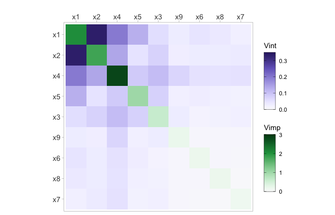
Network plot
With viviNetwork, a network graph is produced to
visualize both importance and interactions. Similar to
viviHeatmap, this function only requires a
vivid matrix as input and uses visual elements, such as
size and color, to depict the magnitude of importance and interaction
values. The graph displays each variable as a node, where its size and
color reflect its importance (larger and darker nodes indicate higher
importance). Pairwise interactions are displayed through connecting
edges, where thicker and darker edges indicate higher interaction
values.
To begin we show the network using default settings.
viviNetwork(mat = viviRf)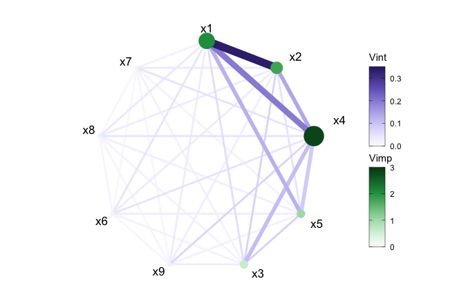
We can also filter out any interactions below a set value using the
intThreshold argument. This can be useful when the number
of variables included in the model is large or just to highlight the
strongest interactions. By default, unconnected nodes are displayed,
however, they can be removed by setting the argument
removeNode = T.
viviNetwork(mat = viviRf, intThreshold = 0.12, removeNode = FALSE)
viviNetwork(mat = viviRf, intThreshold = 0.12, removeNode = TRUE)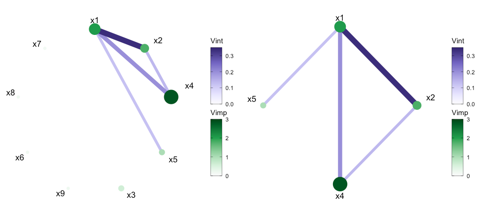
The network plot offers multiple customization possibilities when it
comes to displaying the network style plot through use of the
layout argument. The default layout is a circle but the
argument accepts any igraph layout function or a numeric
matrix with two columns, one row per node.
viviNetwork(mat = viviRf,
layout = cbind(c(1,1,1,1,2,2,2,2,2), c(1,2,4,5,1,2,3,4,5)))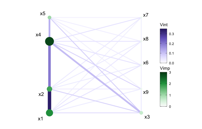
Finally, for the network plot to highlight any relationships in the
model fit, we can cluster variables together using the
cluster argument. This argument can either accept a vector
of cluster memberships for nodes or an igraph package
clustering function. In the following example, we manually select
variables with VIVI values in the top 20%. This selection allows us to
focus only on the variables with the most impact on the response. The
variables that remain are \(x1\) to
\(x5\). We then perform a hierarchical
clustering treating variable interactions as similarities, with the goal
of grouping together high-interaction variables. Here we manually select
the number of groups we want to show via the cutree
function (which cuts clustered data into a desired number of groups).
Finally we rearrange the layout using igraph. Here,
igraph::layout_as_star places the first variable (deemed
most relevant using the VIVI seriation process) at the center, which in
Figure 5 emphasizes its key role as the most important predictor which
also has the strongest interactions.
set.seed(1701)
# clustered and filtered network for rf
intVals <- viviRf
diag(intVals) <- NA
# select VIVI values in top 20%
impTresh <- quantile(diag(viviRf),.8)
intThresh <- quantile(intVals,.8,na.rm=TRUE)
sv <- which(diag(viviRf) > impTresh |
apply(intVals, 1, max, na.rm=TRUE) > intThresh)
h <- hclust(-as.dist(viviRf[sv,sv]), method="single")
viviNetwork(viviRf[sv,sv],
cluster = cutree(h, k = 3), # specify number of groups
layout = igraph::layout_as_star)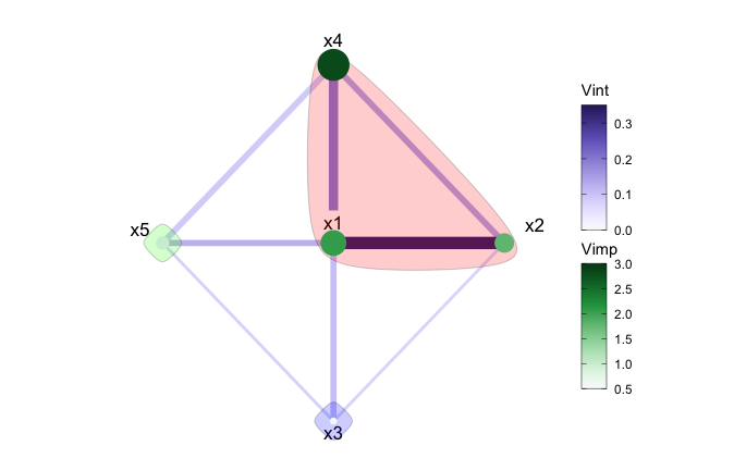
In Figure 5, after applying a hierarchical clustering, we can see the strongest mutual interactions have been grouped together. Namley; \(x1\), \(x2\), and \(x4\). The remaining variables are individually clustered.
Univariate Partial Dependence Plot
The pdpVars function constructs a grid of univariate
PDPs with ICE curves for selected variables. We use ICE curves to assist
in the identification of linear or non-linear effects. The fit, data
frame used to train the model, and the name of the response variable are
required inputs.
In the example below, we select the first five variables from our
created vivid matrix to display and set the number of ICE
curves to be displayed to be 100, via the nIce
argument.
top5 <- colnames(viviRf)[1:5]
pdpVars(data = myData,
fit = rf,
response = 'y',
vars = top5,
nIce = 100)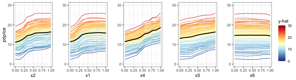
Generalized partial dependence pairs plot
By employing a matrix layout, the pdpPairs function generates a
generalized pairs partial dependence plot (GPDP) that encompasses
univariate partial dependence (with ICE curves) on the diagonal,
bivariate partial dependence on the upper diagonal, and a scatterplot of
raw variable values on the lower diagonal, where all colours are
assigned to points and ICE curves by the predicted \(\hat{y}\) value. As with the univariate
PDP, the fit, data frame used to train the model, and the name of the
response variable are required inputs. For a full description of all the
function arguments, see ?vivid::pdpPairs. In the following
example, we select the first five variables to display and set the
number of shown ICE curves to 100.
set.seed(1701)
pdpPairs(data = myData,
fit = rf,
response = "y",
nmax = 500,
gridSize = 10,
vars = c("x1", "x2", "x3", "x4", "x5"),
nIce = 100)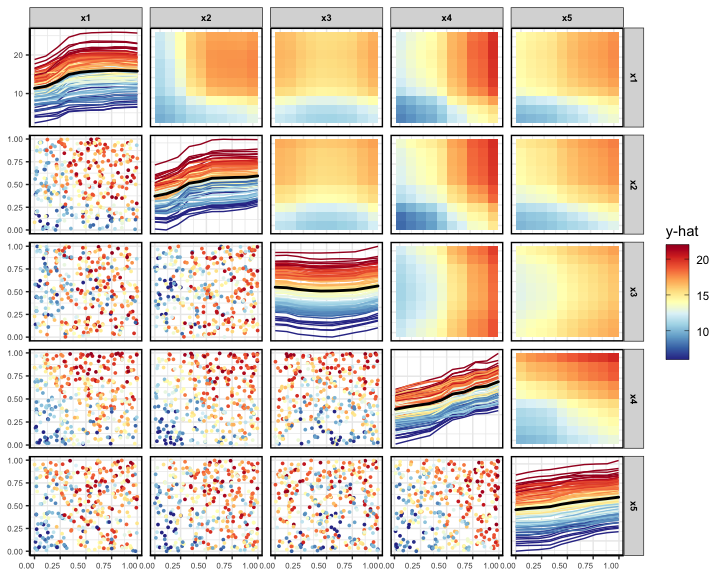
Partial dependence ‘Zenplot’
The pdpZen function utilizes a space-saving technique
based on graph Eulerians, introduced by Hierholzer and Wiener in
1873[25] to create partial dependence plots. We refer to these plots as
zen-partial dependence plots (ZPDP). These plots are based on zigzag
expanded navigation plots, also known as zenplots, which are available
in the zenplots package[26]. Zenplots were designed to showcase paired
graphs of high-dimensional data with a focus on the most significant 2D
displays. In our version, we display bivariate PDPs that emphasize
variables with the most significant interaction values in a compact
zigzag layout. This format is useful when dealing with high-dimensional
predictor space.
To begin, we show a ZPDP using all the variables in the model.
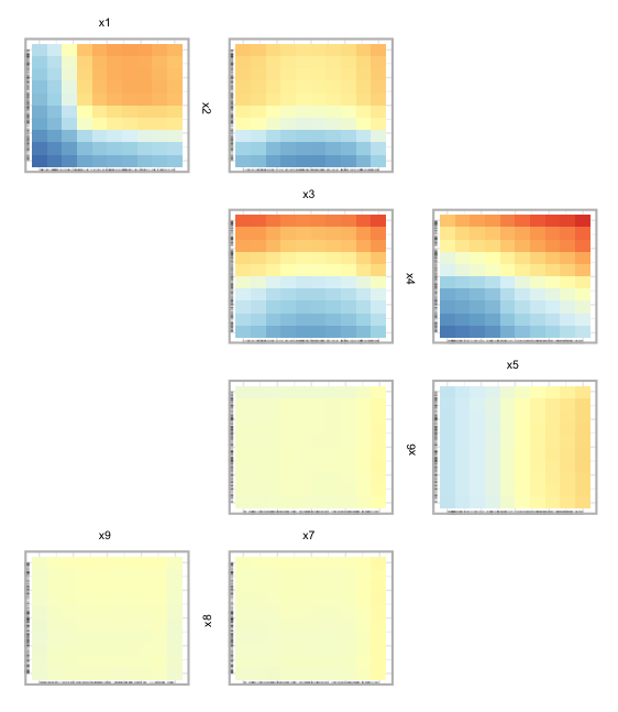
In Fig 8, we can see PDPs laid out in a zigzag structure, with the
most influential variable pairs displayed at the top and generally
decreasing as we move down. In Figure 9, below, we select a subset of
variables to display. In this case we select the first five variables
from the data. The argument zpath specifies the variables
to be plotted, defaulting to all dataset variables aside from the
response.
set.seed(1701)
pdpZen(data = myData,
fit = rf,
response = "y",
nmax = 500,
gridSize = 10,
zpath = c("x1", "x2", "x3", "x4", "x5"))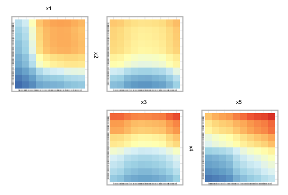
We can also create a sequence or sequences of variable paths for use
in pdpZen. via the zPath function. The zPath
function takes four arguments. These are: viv - a matrix of
interaction values, cutoff - exclude interaction values
below this threshold, method - a string indicating which
method to use to create the path, and connect - a logical
value indicating if separate Eulerians should be connected.
You can choose between two methods when using the zPath
function: "greedy.weighted" and
"strictly.weighted". The first method utilizes a greedy
Eulerian path algorithm for connected graphs. This method traverses each
edge at least once, beginning at the highest-weighted edge, and moving
on to the remaining edges while prioritizing the highest-weighted edge.
If the graph has an odd number of nodes, some edges may be visited more
than once, or additional edges may be visited. The second method,
"strictly.weighted" visits edges in strictly decreasing
order by weight (in this case, interaction values). If the connect
argument is set to TRUE, the sequences generated by the
strictly weighted method are combined to create a single path. In the
code below, we provide an example of creating zen-paths using the
"strictly.weighted" method, from the top 10% of interaction
scores in viviRf (i.e., the created vivid
matrix.)
# set zpaths with different parameters
intVals <- viviRf
diag(intVals) <- NA
intThresh <- quantile(intVals, .90, na.rm=TRUE)
zpSw <- zPath(viv = viviRf, cutoff = intThresh, connect = FALSE, method = 'strictly.weighted')
set.seed(1701)
pdpZen(data = myData,
fit = rf,
response = "y",
nmax = 500,
gridSize = 10,
zpath = zpSw)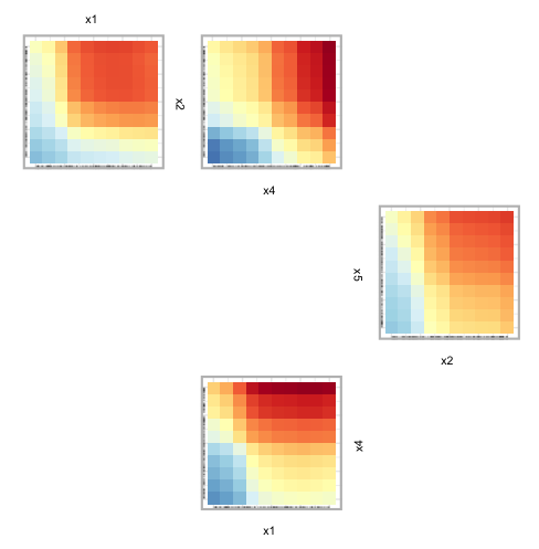
Custom Predict Function
Example using the predict function
We supply an internal custom predict function called
CVpredictfun to both importance and interaction
calculations. CVpredictfun is a wrapper around
CVpredict from the condvis2 package[27].
CVpredict accepts a broad range of fit classes thus
streamlining the process of calculating variable importance and
interactions. In situations where the fit class is not handled by
CVpredict, supplying a custom predict function to the
vivi function by way of the predictFun
argument allows the agnostic VIVI values to be calculated. For an
example of using vivid with many different types of models,
see the Section Model Fits In the following, we provide a
small example of using such a fit with vivid by using the
xgboost package to create a gradient boosting machine
(GBM). To begin we build the model.
library("xgboost")
gbst <- xgboost(data = as.matrix(myData[,1:9]),
label = as.matrix(myData[,10]),
nrounds = 100,
verbose = 0)We then build the vivid matrix for the GBM fit using a
custom predict function, which must be of the form given in the code
snippet. Note that the term data must be used in the custom
predict function. Do not use the actual name of the data. Additionally,
the response variable should be included when generating the predict
function for xgboost.
# predict function for GBM
pFun <- function(fit, data, ...) predict(fit, as.matrix(data[,1:9]))
set.seed(1701)
viviGBst <- vivi(fit = gbst,
data = myData,
response = "y",
reorder = FALSE,
normalized = FALSE,
predictFun = pFun,
gridSize = 50,
nmax = 500)From this we can now create our visualisations. For brevity, we only show the heatmap.
viviHeatmap(mat = viviGBst)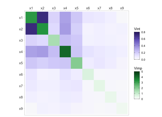
Embedded Vimps
Using embedded importance metrics
In the following we show examples of how to select different
(embedded) importance metrics for use with the vivi
function. To illustrate the process we use a random forest model fit
using the randomForest and ranger
packages.
In randomForest
To begin we fit the randomForest model.
set.seed(1701)
rfEmbedded <- randomForest(y ~ ., data = myData, importance = TRUE)Note that for a randomForest model, if the argument
importance = TRUE, then multiple importance metrics are
returned. In this case, as we have a regression random forest, the
returned importance metrics are the percent increase in mean squared
error (%IncMSE) and the increase in node purity (IncNodePurity). In
order to choose a specific metric for use with vivid, it is
necessary to specify one of the importance metrics returned by the
random forest as the argument for the importanceType
parameter in the vivi function. In the code below we select
the %IncMSE as the importance metric.
viviRfEmbedded <- vivi(fit = rfEmbedded,
data = myData,
response = "y",
importanceType = "%IncMSE")In ranger
For a ranger random forest model, the importance metric
must be specified when fitting the model. In the code below, we select
the impurity as the importance metric.
Then when calling the vivi function, the
importanceType argument is set to the same selected
importance metric.
viviRangEmbedded <- vivi(fit = rang,
data = myData,
response = "y",
importanceType = "impurity")Model Fits
Models Used
Additional examples are shown for several different machine learning
models (See Articles tab above). These scripts are designed as a
quick-stop guide of how to use some of the more popular machine learning
R packages with vivid and to familiarize the user with
implementing vivid. See individual vignette scripts for
specific models. As previously discussed, vivid will work
out-of-the-box with several of these R packages, however, with others, a
custom predict function will have to be supplied. The packages (and
models) shown here are:
- caret - Neural Network
- randomForest - Random Forest
- ranger - Random Forest
- e1071 - Support Vector Machine
- gbm - Gradient Boosted Machine
- mlr3 - k-nearest Neighbours
- xgboost - eXtreme Gradient Boosting
- bartMachine - BART
- keras - Neural Network
Classification
Classification example
In this section, we briefly describe how to apply the above
visualisations to a classification example using the iris
data set.
To begin we fit a ranger random forest model with
“Species” as the response and create the vivi matrix setting the
category for classification to be “setosa” using class.
Heatmap
Next we plot the heatmap and network plot of the iris data.
viviHeatmap(mat = viviClassif)
viviNetwork(mat = viviClassif)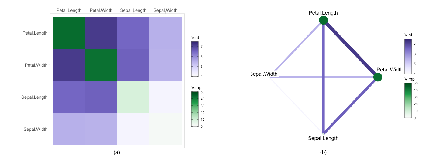
GPDP
As mentioned above, as PDPs are evaluated on a grid and can extrapolate where there is no data. To solve this issue we calculate a convex hull around the data and remove any points that fall outside the convex hull, as shown below.
set.seed(1701)
pdpPairs(data = iris,
fit = rfClassif,
response = "Species",
class = "setosa",
convexHull = T,
gridSize = 10,
nmax = 50) 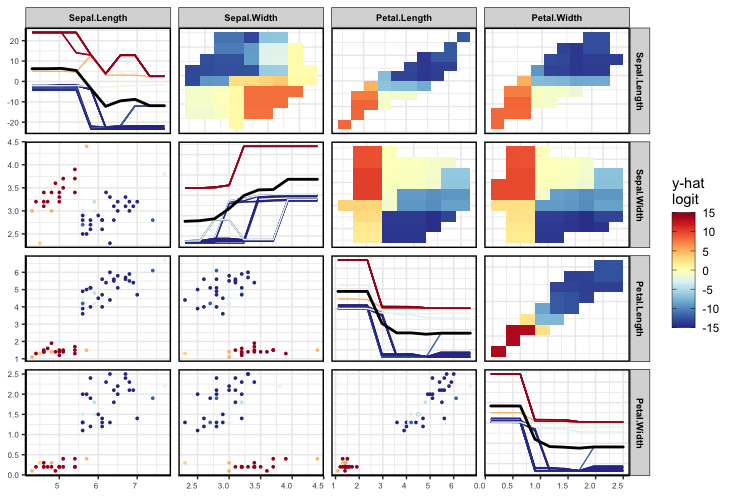
Full Script
This section consolidates the Sections Data and Model,
vivi, Visualisations
Custom Predict Function, and Embedded Vimps
into a single script to facilitate ease of viewing.
# Load libraries
library("vivid")
library("randomForest")
# Create data based on the Friedman equation
set.seed(101)
genFriedman <- function(noFeatures = 10, noSamples = 100, sigma = 1) {
# Create dataframe with named columns
df <- setNames(as.data.frame(matrix(runif(noSamples * noFeatures, 0, 1), nrow = noSamples),
stringsAsFactors = FALSE),
paste0("x", 1:noFeatures))
# Equation: y = 10sin(πx1x2) + 20(x3−0.5)^2 + 10x4 + 5x5 + ε
df$y <- 10 * sin(pi * df$x1 * df$x2) +
20 * (df$x3 - 0.5)^2 +
10 * df$x4 +
5 * df$x5 +
rnorm(noSamples, sd = sigma) # error
return(df)
}
myData <- genFriedman(noFeatures = 9, noSamples = 350, sigma = 1)
-------------------------------------------------------------------
# Fit random forest using randomForest package
set.seed(1701)
rf <- randomForest(y ~ ., data = myData)
-------------------------------------------------------------------
# Run vivid
set.seed(1701)
viviRf  <- vivi(fit = rf,
                data = myData,
                response = "y",
                gridSize = 50,
                importanceType = "agnostic",
                nmax = 500,
                reorder = TRUE,
                predictFun = NULL,
                numPerm = 4,
                showVimpError = FALSE)
-------------------------------------------------------------------
# Visualisations:
# 1.0: Heatmap
viviHeatmap(mat = viviRf)
# 1.1: Heatmap with custom colour palettes and a small border around the diagonal importance values
viviHeatmap(mat = viviRf,
intPal = colorspace::sequential_hcl(palette = "Oslo", n = 100),
impPal = rev(colorspace::sequential_hcl(palette = "Reds 3", n = 100)),
border = T)
# 2.0: Network
viviNetwork(mat = viviRf)
# 2.1: Network with interactions below 0.12 are filtered.
# By default, unconnected nodes are displayed, however, they can be removed by setting `removeNode = T`
viviNetwork(mat = viviRf, intThreshold = 0.12, removeNode = FALSE)
viviNetwork(mat = viviRf, intThreshold = 0.12, removeNode = TRUE)
# 2.3: Network clustered and with interactions thresholded
set.seed(1701)
# clustered and filtered network for rf
intVals <- viviRf
diag(intVals) <- NA
# select VIVI values in top 20%
impTresh <- quantile(diag(viviRf),.8)
intThresh <- quantile(intVals,.8,na.rm=TRUE)
sv <- which(diag(viviRf) > impTresh |
apply(intVals, 1, max, na.rm=TRUE) > intThresh)
h <- hclust(-as.dist(viviRf[sv,sv]), method="single")
# plot
viviNetwork(viviRf[sv,sv],
cluster = cutree(h, k = 3), # specify number of groups
layout = igraph::layout_as_star)
# 3.0: PDP of the top 5 variables extracted from the vivi matrix and number of ICe curves set to 100
top5 <- colnames(viviRf)[1:5]
pdpVars(data = myData,
        fit = rf,
        response = 'y',
        vars = top5,
        nIce = 100)
# 4.0: GPDP of the variables x1 to x5, with 100 ICE curves shown.
set.seed(1701)
pdpPairs(data = myData,
         fit =  rf,
         response = "y",
         nmax = 500,
         gridSize = 10,
         vars = c("x1", "x2", "x3", "x4", "x5"),
         nIce = 100)
# 5.0: ZPDP of all variables
set.seed(1701)
pdpZen(data = myData, fit = rf, response = "y", nmax = 500, gridSize = 10)
# 5.1: ZPDP where the `zpath` argument specifies the variables to be plotted. In this case, x1 to x5.
set.seed(1701)
pdpZen(data = myData,
       fit = rf,
       response = "y",
       nmax = 500,
       gridSize = 10,
       zpath = c("x1", "x2", "x3", "x4", "x5"))
# 5.2: ZPDP with the zpaths set with different parameters using the `zPath` function.
intVals <- viviRf
diag(intVals) <- NA
intThresh <- quantile(intVals, .90, na.rm=TRUE)
zpSw <- zPath(viv = viviRf, cutoff = intThresh, connect = FALSE, method = 'strictly.weighted')
set.seed(1701)
pdpZen(data = myData,
fit = rf,
response = "y",
nmax = 500,
gridSize = 10,
zpath = zpSw)Using a custom predict function
library("vivid")
library("xgboost")
gbst <- xgboost(data = as.matrix(myData[,1:9]),
                label =  as.matrix(myData[,10]),
                nrounds = 100,
                verbose = 0)
# predict function for GBM
pFun <- function(fit, data, ...) predict(fit, as.matrix(data[,1:9]))
# run vivid
set.seed(1701)
viviGBst <- vivi(fit = gbst,
data = myData,
response = "y",
reorder = FALSE,
normalized = FALSE,
predictFun = pFun,
gridSize = 50,
nmax = 500)
# plot heatmap
viviHeatmap(mat = viviGBst)Using embedded variable importance
library("vivid")
library("randomForest")
library("ranger")
# randomForest
# Note importance must be set to TRUE to use embedded importance scores.
set.seed(1701)
rfEmbedded <- randomForest(y ~ ., data = myData, importance = TRUE)
# Using % increase in MSE as the importance metric in vivid
viviRfEmbedded <- vivi(fit = rfEmbedded,
                       data = myData,
                       response = "y",
                       importanceType = "%IncMSE")
# Plot Heatmap
viviHeatmap(mat = viviRfEmbedded)
# ranger
# Note the importance metric is selected directly in ranger
rang <- ranger(y~., data = myData, importance = 'impurity')
# Run vivid
viviRangEmbedded <- vivi(fit = rang,
                         data = myData,
                         response = "y",
                         importanceType = "impurity")
# Plot Heatmap
viviHeatmap(mat = viviRangEmbedded)Classification
library("vivid")
library("randomForest")
set.seed(1701)
rfClassif <- ranger(Species~ ., data = iris, probability = T,
                    importance = "impurity")

set.seed(101)
viviClassif  <- vivi(fit = rfClassif,
                     data = iris,
                     response = "Species",
                     gridSize = 10,
                     nmax = 50,
                     reorder = TRUE,
                     class = "setosa")
viviHeatmap(mat = viviClassif)
set.seed(1701)
pdpPairs(data = iris,
         fit = rfClassif,
         response = "Species",
         class = "setosa",
         convexHull = T,
         gridSize = 10,
nmax = 50) References
Alan Inglis and Andrew Parnell and Catherine B. Hurley (2022) Visualizing Variable Importance and Variable Interaction Effects in Machine Learning Models. Journal of Computational and Graphical Statistics (3), pages 1-13
Breiman, Leo. 2001. “Random Forests.” Machine Learning 45 (1): 5–32. https://doi.org/10.1023/A: 1010933404324.
Friedman, J. H. 2000. “Greedy Function Approximation: A Gradient Boosting Machine.” The Annals of Statistics 29 (November). https://doi.org/10.1214/aos/1013203451.
Chipman, Hugh A, Edward I George, and Robert E McCulloch. 2010. “BART: Bayesian Additive Regression Trees.” The Annals of Applied Statistics 4 (1): 266–98.
Paluszynska, Aleksandra, Przemyslaw Biecek, and Yue Jiang. 2020. randomForestExplainer: Explaining and Visualizing Random Forests in Terms of Variable Importance. https://CRAN.R-project.org/ package=randomForestExplainer.
Ishwaran, Hemant, Udaya B Kogalur, Eiran Z Gorodeski, Andy J Minn, and Michael S Lauer. 2010. “High-Dimensional Variable Selection for Survival Data.” Journal of the American Statistical Associa- tion 105 (489): 205–17.
Probst, Philipp. 2020. varImp: RF Variable Importance for Arbitrary Measures. https://CRAN.R-project. org/package=varImp.
Strobl, Carolin, Anne-Laure Boulesteix, Thomas Kneib, Thomas Augustin, and Achim Zeileis. 2008. “Conditional Variable Importance for Random Forests.” BMC Bioinformatics 9 (307). https://doi. org/10.1186/1471-2105-9-307
Maksymiuk, Szymon, Ewelina Karbowiak, and Przemyslaw Biecek. 2021. EIX: Explain Interactions in ’XGBoost’. https://CRAN.R-project.org/package=EIX.
Molnar, Christoph, Bernd Bischl, and Giuseppe Casalicchio. 2018. “Iml: An r Package for Interpretable Machine Learning.” JOSS 3 (26): 786. https://doi.org/10.21105/joss.00786.
Mayer M (2023). flashlight: Shed Light on Black Box Machine Learning Models. R package version 0.9.0, https://CRAN.R-project.org/package=flashlight.
Biecek, Przemyslaw. 2018. “DALEX: Explainers for Complex Predictive Models in R.” Journal of Machine Learning Research 19 (84): 1–5. https://jmlr.org/papers/v19/18-416.html.
Greenwell, Brandon M., and Bradley C. Boehmke. 2020. “Variable Importance Plots—an Introduction to the vip Package.” The R Journal 12 (1): 343–66. https://doi.org/10.32614/RJ-2020-013.
Fisher A., Rudin C., Dominici F. (2018). All Models are Wrong but many are Useful: Variable Importance for Black-Box, Proprietary, or Misspecified Prediction Models, using Model Class Reliance. Arxiv.
Marvin N. Wright, Andreas Ziegler (2017). ranger: A Fast Implementation of Random Forests for High Dimensional Data in C++ and R. Journal of Statistical Software, 77(1), 1-17. doi:10.18637/jss.v077.i01], randomForest^[A. Liaw and M. Wiener (2002). Classification and Regression by randomForest. R News 2(3), 18–22.
Bischl B, Lang M, Kotthoff L, Schiffner J, Richter J, Studerus E, Casalicchio G, Jones Z (2016). “mlr: Machine Learning in R.” Journal of Machine Learning Research, 17(170), 1-5. https://jmlr.org/papers/v17/15-066.html.
Lang M, Binder M, Richter J, Schratz P, Pfisterer F, Coors S, Au Q, Casalicchio G, Kotthoff L, Bischl B (2019). “mlr3: A modern object-oriented machine learning framework in R.” Journal of Open Source Software. doi:10.21105/joss.01903
Kuhn M, Vaughan D (2023). parsnip: A Common API to Modeling and Analysis Functions. R package version 1.1.1, https://CRAN.R-project.org/package=parsnip.
Friedman, J. H. 2000. “Greedy Function Approximation: A Gradient Boosting Machine.” The Annals of Statistics 29 (November). https://doi.org/10.1214/aos/1013203451.
Goldstein, Alex, Adam Kapelner, Justin Bleich, and Emil Pitkin. 2015. “Peeking Inside the Black Box: Visualizing Statistical Learning with Plots of Individual Conditional Expectation.” Journal of Computational and Graphical Statistics 24 (1): 44–65. https://doi.org/10.1080/10618600.2014. 907095.
Greenwell, Brandon M. 2017. “pdp: An r Package for Constructing Partial Dependence Plots.” The R Journal 9 (1): 421–36. https://journal.r-project.org/archive/2017/RJ-2017-016/index.html.
Friedman, J. H. and Popescu, B. E. (2008). “Predictive learning via rule ensembles.” The Annals of Applied Statistics. JSTOR, 916–54.
Friedman, Jerome H. (1991) Multivariate adaptive regression splines. The Annals of Statistics 19 (1), pages 1-67.
Zeileis, Achim, Jason C. Fisher, Kurt Hornik, Ross Ihaka, Claire D. McWhite, Paul Murrell, Reto Stauffer, and Claus O. Wilke. 2020. “Colorspace: A Toolbox for Manipulating and Assessing Colors and Palettes.” Journal of Statistical Software, Articles 96 (1): 1–49
Hierholzer, Carl, and Chr Wiener. 1873. “Über Die möglichkeit, Einen Linienzug Ohne Wiederholung Und Ohne Unterbrechung Zu Umfahren.” Mathematische Annalen 6 (1): 30–32.
Hofert, Marius, and Wayne Oldford. 2020. “Zigzag Expanded Navigation Plots in R: The R Package zenplots.” Journal of Statistical Software 95 (4): 1–44.
Hurley, Catherine, Mark OConnell, and Katarina Domijan. 2022. Condvis2: Interactive Conditional Visualization for Supervised and Unsupervised Models in Shiny.