corrViz
corrViz.RmdIntroduction

corrViz is an R package designed to help users visualize
correlations between variables in their datasets. With the ever-growing
size and complexity of datasets, it is crucial to have a clear
understanding of the relationships between variables. This package aims
to provide an easy and effective way to explore and visualize these
correlations, making it easier to interpret and communicate results.
This vignette will introduce you to the main features and functions
of the corrViz package, guiding you through the process of
creating visually appealing and informative correlation plots. By the
end of this tutorial, you should be able to use corrViz to
create various types of correlation visualizations, customize their
appearance, and gain insights into the relationships within your
dataset.
Download the development version from GitHub with:
# install.packages("devtools")
devtools::install_github("AlanInglis/corrViz")
You can then load the package with:
library(corrViz)Methods
The corrViz package offers several visualization methods
to help you explore and communicate correlations effectively, with an
emphasis on interactivity. The only required inputs for all
corrViz functions are either a dataset or a square matrix
of correlations to be visualized. Each visualization has multiple
customization options, which are outlined in this document. The
plotly package1 is used to create interactive graphics.
To begin we will create a correlation matrix using the
mtcars data set.
cm <- cor(mtcars)Heat map
The following code produces an interactive heatmap displaying variable correlations, which can be seen in Figure 1. The additional arguments here are:
-
display: Choose to display the upper, lower, or full matrix of values using"upper","lower", or"all", respectively. -
reorder: If TRUE (the default) then the heatmap is reordered to group correlations. -
pal: The colour palette to use for displaying values.
Hovering the mouse over a cell in the heatmap will display a box containing the variable pair names and their associated correlation value. Dragging the mouse will zoom in on the selected area and double-clicking the plot will reset the zoom.
corrHeatmap(mat = cm,
            display = 'all',
            reorder = TRUE,
pal = colorRampPalette(c("darkblue", 'white', 'darkred'))(100))In Figure 1 we set display = "all" which shows the full
heatmap. To display only the upper or lower portion of the heatmap we
use the appropriate argument in display, as shown in Figure
2 (which shows the lower section).
corrHeatmap(mat = cm,
            display = 'lower',
reorder = FALSE)Network
For build our network plots we use the visNetwork
package2.
the additional arguments for producing a network plot are:
-
threshold: Used to filter correlations with an absolute value lower than selected value. -
layout: Use anigraphpackage3 layout to display network. -
width: The width of the viewing window -
height: The height of the vewing window -
physics: If TRUE (the default) then physics is enabled on nodes. This will alter the layout to be roughly circular.
corrNetwork(mat = cm,
            threshold = 0,
            layout = "layout_nicely",
            width = "100%",
            height = "400px",
            physics = FALSE)
Figure 3 shows a network in which every node corresponds to a variable present in the data, and each connecting edge denotes the correlation between them. The edges are color-coded to signify the correlation, with red indicating a positive correlation and blue representing a negative one. The thickness of each edge corresponds to the magnitude of the correlation between two variables. Hovering the mouse over an edge will display a box containing the correlation value for that edge.
When clicking on a node, the selected node will change colour and
only nodes that connected to the selected node are highlighted (a better
example of this can be seen in Figure 4). Additionally, the top right of
the plot has a drop-down box which can be used to select a particular
node/variable. DOing so will have the same effect as clicking on the
node. The nodes themselves can be re-positioned by dragging them (only
works when physics = FALSE). The bottom left of the plot
contains controls to zoom in or out, whereas the bottom right has
controls to pan the image.
In Figure 4, below, we set the threshold argument to
equal 0.8. This will filter any correlations from our visualization with
an absolute value lower than 0.8. Additionally, in Figure 4,
physics = TRUE. By enabling physics, each node is repelled
from each other and the edges act like springs. When
physics = TRUE, the nodes can still be dragged, however as
each node repels each other with equal force, the display will try to
push each node away from each other.
corrNetwork(mat = cm,
            threshold = 0.8,
physics = TRUE)Solar plot
In a solar system correlation plot, the dependent (sun) variable of interest is positioned at the center, represented as the sun. The explanatory (planet) variables are depicted as planets orbiting around the sun, with their distance from the sun corresponding to the absolute value of their correlation with the dependent variable. Therefore, the greater the distance of a planet from the sun, the weaker the correlation between the explanatory variable and the dependent variable. # Solar plot animation
In Figure 5 we show an animated version which displays the planet variables orbiting the sun. The additional arguments are:
-
export: If TRUE, then the animation is exported to the user’s machine as a gif. If FALSE (default), then the animation is played in the viewer window. -
num_frames: The number of frames to render. -
path: Path of the directory to save plot to. -
gif_name: File name to create on disk. Must be in the format “myFile.gif”. -
fps: The frame rate of the exported animation in frames/sec. Default is 60 fps and is only used when exporting a gif viaexport = TRUE.
animSolar(mat = cm,
          sun = 'mpg',
          export = FALSE,
          num_frames = 100,
          path = NULL,
          gif_name = "solar_system.gif",
fps = 60)mpg as the sun.
The num_frames argument is used to select the number of
frames. Setting this to a low value will produce the plot quicker,
however having a low number of frames will result in the “planets”
jumping as the frames transition. Additionally, a low values of
num_frames will affect the orbit of the animation when
setting export = FALSE. This differs from the
fps argument which sets the number of frames to play per
second for use when exporting a gif. When export = FALSE
(as is the case in figure 6), a ‘play’ button is provided to start the
animation. Hovering over a planet will display the correlation
value.
Bar plot
Figure 6 shows an interactive barplot displaying correlation values.
The red bars extending right represent the positive correlations whereas
the blue bars extending left represent the negative correlations. The
additional arguements here are: * interactive: If TRUE then
an interactive version of the barplot is displayed. * pal:
The colour palette to use for displaying values.
corrBarplot(mat = cm,
            interactive = TRUE,
pal = colorRampPalette(c("cornflowerblue", 'white', 'tomato'))(100))Hovering the mouse over a bar will display the name of the variable pair and their associated correlation.
Bubble
Figure 7 is similar to the heatmap shown in Figures 1 and 2, except this time each variable pair is represented as a circle, with the size corresponding the the magnitude of the correlation. Hovering over a bubble will display the variable pair names and their associated correlation. The additional arguments for this function are:
-
display: Choose to display the upper, lower, or full matrix of values using “upper”, “lower”, or “all”, respectively. -
pal: The colour palette to use for displaying values.
corrBubble(mat = cm,
           display = 'all',
pal = colorRampPalette(c("cornflowerblue", "white", "tomato"))(100))As with the heatmap, we can also display a portion of the plot using
the display argument, as shown in Figure 8.
corrBubble(mat = cm,
display = 'upper')Scatterplot matrix pairs plot
Our next plot is a scatterplot matrix (or pairs plot) displaying correlation values in the upper triangle of the plot, with the stars representing the correlation significance. The diagonal contains density plots of the data. The lower triangle displays a scatterplot of the data values with a smooth-line (which is coloured according the the correlation value for the variable pair). The additional arguments are:
-
interactive: A logical value indicating whether the output plot should be interactive (TRUE) or static (FALSE). Default is TRUE. -
col_by: An optional character string specifying the name of the column in the data frame to be used for coloring points. Default is NULL.
Figure 9 shows an interactive scatterplot for the first 5 variables
found in the mtcars dataset. In this case, the scatterplot
points are coloured by the variable cyl.
corrPairs(data = mtcars[1:5],
         interactive = TRUE,
col_by = "cyl")mtcars dataset.
Sankey plot
An alternative method for viewing correlation is by using a Sankey plot. Sankey plots are primarily used to represent the flow of information between nodes in a network. These diagrams consist of interconnected pathways, with their width proportionally representing the quantity being transferred (in this case, the absolute value of the correlation). Figure 10 provides an example. In this case the correlations are filtered to show correlations with an absolute value above 0.6. The additional arguments are:
-
threshold: Filter correlations with an absolute value lower than selected value. -
colour: A logical value indicating whether to color the links based on positive or negative correlation. Default is FALSE (links are grey).
corrSankey(mat = cm,
           threshold = 0.6,
colour = FALSE)Setting colour = TRUE colours the links based on their
correlation. In figure 11, the threshold argument is set to
equal 0.8.
corrSankey(mat = cm,
           threshold = 0.8,
colour = TRUE)Shiny Plot
We also provide an option to create an interactive Shiny plot. This plot is a useful tool for quickly checking the correlation between two variables. In Figure 12 below we show a screenshot of the Shiny app in use. The additional arguments are:
-
data: A data frame with the variables to be analyzed. -
x_var: The name of the variable to be plotted on the X-axis. -
y_var: The name of the variable to be plotted on the Y-axis. -
color_var: The name of the variable to be used for coloring the points on the scatter plot. -
size_var: The name of the variable to be used for sizing the points on the scatter plot. -
correlation_method: The method to be used for computing the correlation coefficient, must be one of “pearson”, “spearman” or “kendall”, the default is “pearson”.
corrShiny(data = mtcars,
          x_var = "wt",
          y_var = "mpg",
          color_var = "cyl",
          size_var = "hp")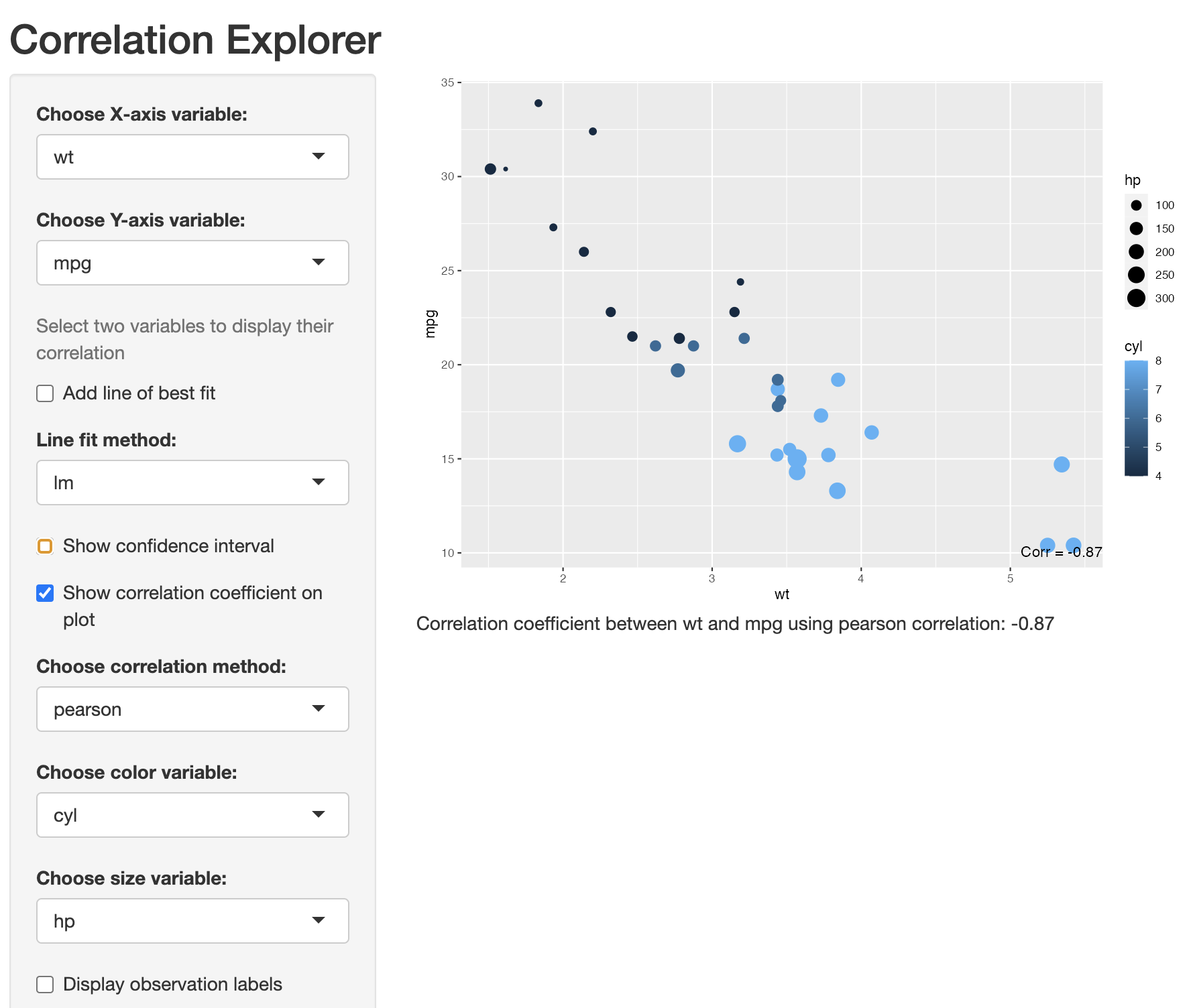
In the code above, although we chose with variables to display, colour and size by, all of these options options can be changrd within the Shiny app. As can be seen in Figure 12, we provide the options to choose both the X and Y variable to display in the plotting window. The correlation value is displayed in the Figure caption or can be displayed in the bottom right of the plot by checking the show correlation coefficient on plot box. The correlation method can be changed by clicking on the appropriate drop-down menu and we provide three correlation method options. They are; Pearson, Spearman, or Kendall.
A line of best fit (with or without confidence intervals) can be overlayed on top off the data and provide two options to fit the line, i.e., \(lm\) of \(loess\). To aid in interpretability, we also provide options to colour the points in the plot by a selected variable, to size the points by a selected variable, or to show observation labels on the plot.
Static Plots
In addition to interactive plots, corrViz also provides
numerous static plots. In Figures 13 to 16 we show a selection of
options to display correlations on a grid. The plot types can be any of
square, circle, text, or pie, which
can be set via the type argument. If the type
argument is set to either square or circle,
then the shapes are sized, with the size representing the absolute value
of the correlation. The additional arguments are:
-
showDiag: A logical value, if TRUE (default), the diagonal of the correlation matrix is shown. -
pal: A color palette function, used for the correlation coefficient colors.
In Figure 13, we set type = 'square'
corrGrid(mat = cm[1:7,1:7],
         type = 'square')
In Figure 14, we set type = 'circle'.
corrGrid(mat = cm[1:7,1:7],
         type = 'circle')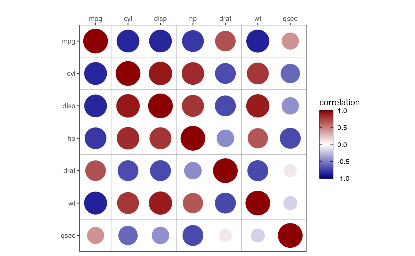
In Figure 15, we set type = 'text'. The text
corrGrid(mat = cm[1:7,1:7],
         type = 'text')
Correlation Pie Plot
In Figure 16, we set type = 'pie'. This plot shows pie
charts where the filled in percentage represents the correlation
value.
corrGrid(mat = cm[1:7,1:7],
         type = 'pie')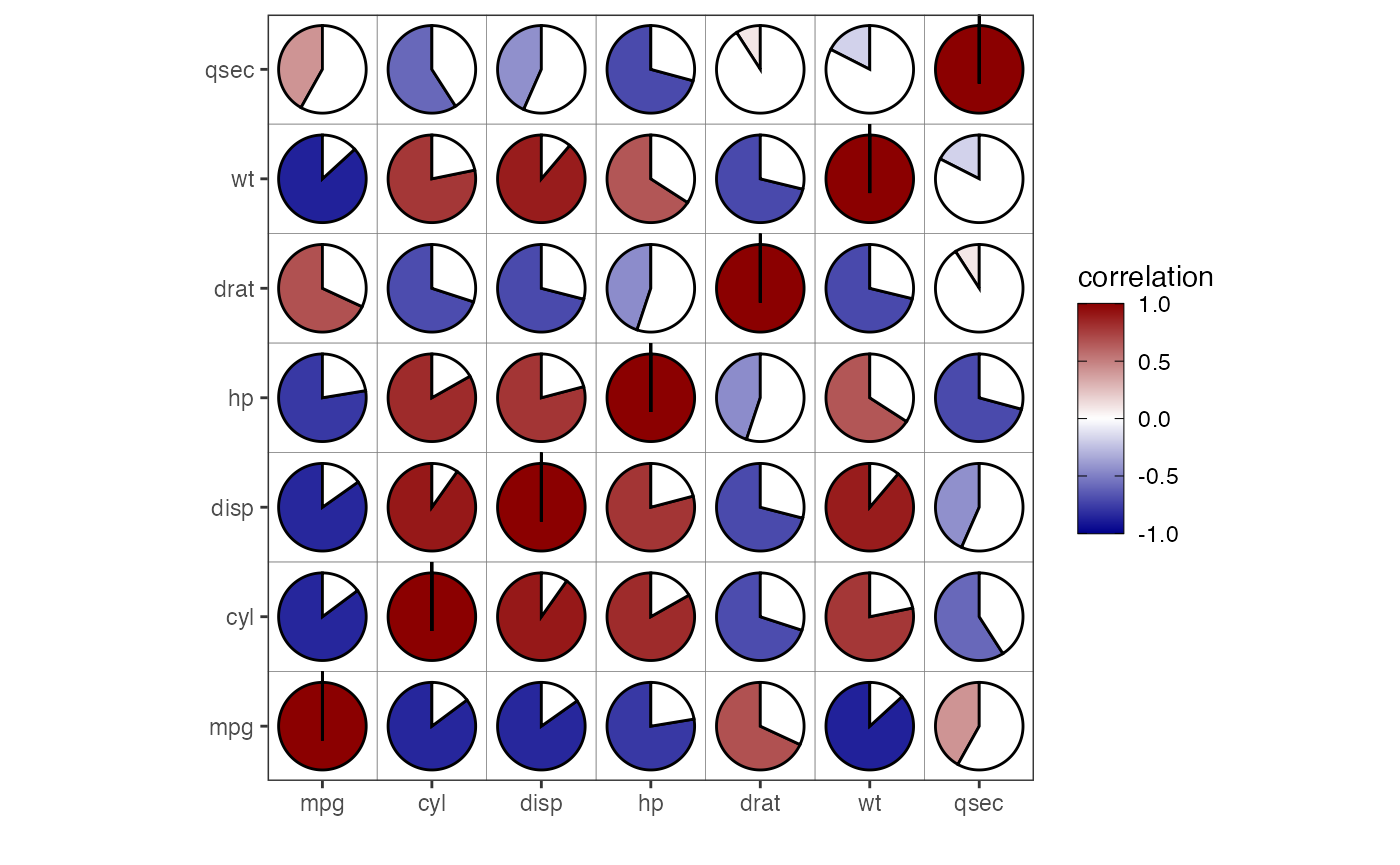
Static Solar Plot
Figure 17 shows a static version of the solar system correlation plot
with mpg selected as the dependent variable via the
sun argument. Planet variables are coloured either red
(positive correlation) or blue (negative correlation).
corrSolar(mat = cm,
          sun = 'mpg')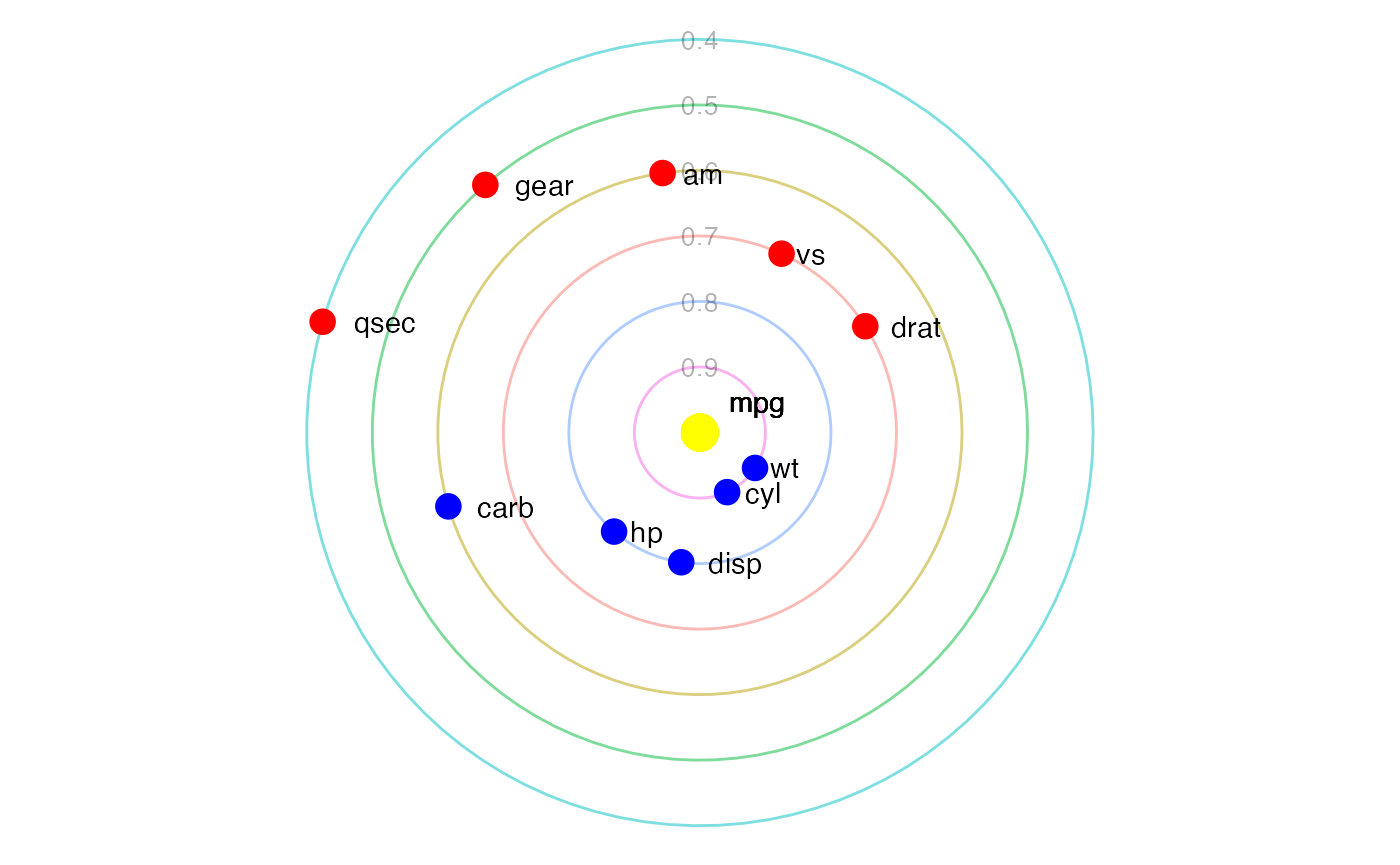
mpg as the sun.
Chord plot
Figure 18 shows a chord plot displaying correlations. This type of
plot can quickly become overloaded with information, so it is
recommended to only use this plot when thresholding correlation values.
In Figure 18, threshold = 0.8, which filters any
correlations from the visualization an absolute value lower than
selected value. The width of the chords corresponds to the magnitude of
the correlation with their colours indicating positive (red) or negative
correlations (blue). The additional arguments are:
-
threshold: Filter correlations with an absolute value lower than selected value. -
circle: If TRUE then plot is displayed as a circle.
corrChord(mat = cm,
          circle = FALSE,
          threshold = 0.8)
Figure 19, displays the same information as Figure 18, but uses a
circular layout, via the circle argument.
corrChord(mat = cm,
          circle = TRUE,
          threshold = 0.8)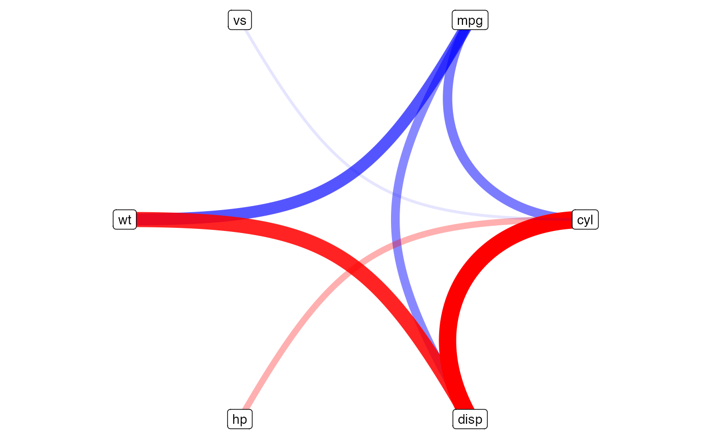
Circular correlation plot
Figure 20 shows a circular correlation plot. This is similar to
Figure 19 but places the variable names on the outside of a neater
circle. As with Figures 18 and 19, the width of the chords in Figure 20
corresponds to the magnitude of the correlation with their colours
indicating positive (red) or negative correlations (blue). The
additional arguments are: * ticks: If TRUE, then axis ticks
are displayed on the circle. * threshold: Filter
correlations with an absolute value lower than selected value.
corrCircle(mat = cm,
           threshold = 0,
           ticks = TRUE)
In Figure 21, we filter the visualization to display correlations with an absolute value greater than 0.8. In this case the axis ticks are removed.
corrCircle(mat = cm,
           ticks = FALSE,
           threshold = 0.8)
Coverting a correlation matrix to data frame
Often it can be useful to convert a matrix to a long-format data
frame. The martrix2long function provides just that. The
only input is a matrix. Below a demonstartion is shown for the first
four colummns of the mtcars data.
corr_matrix <- cor(mtcars[1:4])
long_data_frame <- matrix2long(mat = corr_matrix)
long_data_frame
#>    row_name col_name      value id
#> 1       mpg      mpg  1.0000000  1
#> 2       cyl      mpg -0.8521620  1
#> 3      disp      mpg -0.8475514  1
#> 4        hp      mpg -0.7761684  1
#> 5       mpg      cyl -0.8521620  2
#> 6       cyl      cyl  1.0000000  2
#> 7      disp      cyl  0.9020329  2
#> 8        hp      cyl  0.8324475  2
#> 9       mpg     disp -0.8475514  3
#> 10      cyl     disp  0.9020329  3
#> 11     disp     disp  1.0000000  3
#> 12       hp     disp  0.7909486  3
#> 13      mpg       hp -0.7761684  4
#> 14      cyl       hp  0.8324475  4
#> 15     disp       hp  0.7909486  4
#> 16       hp       hp  1.0000000  4
Conclusion
The corrViz package provides a convenient and powerful
way to visualize correlations between variables in your dataset. With
its variety of visualization methods and customization options, you can
gain valuable insights into the relationships within your data and
communicate these findings effectively.
C. Sievert. Interactive Web-Based Data Visualization with R, plotly, and shiny. Chapman and Hall/CRC Florida, 2020.↩︎
Almende B.V. and Contributors, Thieurmel B (2022). visNetwork: Network Visualization using ‘vis.js’ Library. R package version 2.1.2, https://CRAN.R-project.org/package=visNetwork↩︎
Csardi G, Nepusz T: The igraph software package for complex network research, InterJournal, Complex Systems 1695. 2006. https://igraph.org↩︎