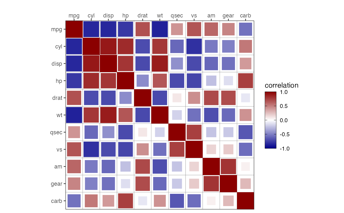
Plot a correlation grid
corrGrid.RdCreate a correlation grid plot to visualize correlations among the columns of a dataset
corrGrid(
  mat,
  display = c("all", "upper", "lower"),
  type = c("square", "circle", "text", "pie"),
  showDiag = "TRUE",
  pal = colorRampPalette(c("darkblue", "white", "darkred"))(100)
)
Arguments
- mat
A square correlation matrix to visualise.
- display
A character string, specifying the display type, one of "all", "upper", or "lower" (default: "all").
- type
A character string, specifying the shape of the correlation coefficients, one of "square", "circle", or "text" (default: "square").
- showDiag
A logical value, if TRUE (default), the diagonal of the correlation matrix is shown.
- pal
A color palette function, used for the correlation coefficient colors.
Value
A correlation grid plot
Examples
cm <- cor(mtcars)
corr_grid_plot <- corrGrid(mat = cm,
                           type = 'square')
