colouR
colouR.Rmd
Introduction to the colouR Package
Welcome to the colouR package, a useful tool for
analyzing and utilizing the colors in images, as well as providing color
palettes inspired by Radiohead and Taylor Swift album covers. Whether
you are a designer looking for inspiration, a data analyst searching for
unique ways to visualize data, or a music lover wanting to incorporate
your favorite album colors into your projects, this package is for you.
It is recommended to view this instructional guide via the GitHub page:
https://alaninglis.github.io/colouR/articles/colouR.html
Package Overview
The colouR package provides a set of functions that
allows you to:
- Extract color values from an image (either JPG or PNG).
- Obtain the top \(n\) colors in the image based on their frequency.
- Group and average colors in the image.
- Utilize color palettes inspired by Radiohead and Taylor Swift album covers.
- These functionalities make the
colouRpackage a versatile and easy-to-use tool for exploring and working with colors in images.
Key Functions
Some of the main functions included in the colouR
package are:
getTopCol(): Extracts the top n colors from an image, with options to exclude black and white shades, and to group and average colors.colPalette(): Creates a color palette based on a specified album cover from either Radiohead or Taylor Swift discography.scaleColor(): Provides a ggplot2-compatible color scale based on the selected album cover palette, for both discrete and continuous data.scaleFill(): Provides a ggplot2-compatible fill scale based on the selected album cover palette, for both discrete and continuous data.groupCols: This function takes a vector of hex color values and groups them using k-means clustering in the RGB color space.avgHex: This function takes a data frame with two columns: one for the hex color values and another for the group labels. It calculates the average color for each group and returns a data frame with the group labels and their corresponding average hex colors.img2pal: Creates a Colour Palette from an input image.plotPalette: This function takes a data frame with a column of colors and plots the colors as a color palette.
In addition, we provide several utility functions, all of which are demonstrated in this document.
Get the top n colours in an image
The first function we demonstrate is the getTopCol
function. This function reads an image file, extracts the colors, and
returns the top n colors based on their frequency in the image.
Optionally, black and white shades can be excluded, and the colors can
be grouped and averaged (more on colour averaging later!). This function
can take in a .jpg, .jpeg, or .png or a url pointing to an image using
any of these formats, via the path argument and returns the
top n colours used in the image.
Function Arguments
The arguments for this function are:
-
pathCharacter, the path to the image file (either jpg or png). -
nInteger, the number of top colors to return. If NULL (default), return all colors. -
excludeLogical, whether to exclude black and white shades. Default is TRUE. -
sigInteger, the number of decimal places for the color percentage. Default is 4. -
avgColsLogical, whether to average the colors by groups. Default is TRUE. -
n_clustersInteger, the number of clusters to use for grouping colors. Default is 5. -
customExcludeCharacter vector. Optional vector of custom color codes in HEX format to be excluded.
Input Image
To begin, lets first take a look at a raw image:
knitr::include_graphics("https://raw.githubusercontent.com/AlanInglis/colouR/master/images/bender.png")
Top 10 colours in image
In the code below we obtain the top 10 most frequent colours used in
the image without using any colour grouping or averaging by setting
avgCols = FALSE. Additionally, we chose not to exclude any
black or white shades by setting exclude = FALSE (note: the
exclude argument excludes many black and white shades,
however this list is far from exhaustive and, consequently, blacks and
white will most likely still be included. However we do allow you to
provide additional black and white hex codes to be included in the
exclude function… more on that below). The output of the
getTopCols when setting the outlined parameters is a data
frame with three columns, that is, the top colors, their frequency, and
percentage in the image.
set.seed(1701) # for reproducability

top10 <- getTopCol(path = "https://raw.githubusercontent.com/AlanInglis/colouR/master/images/bender.png",
                   n = 10,
                   avgCols = FALSE,
                   exclude = FALSE)

# take a look at the top 100 most frequent colours in the image:
top10
#>        hex    freq col_percent
#> 1  #FFFFFF 1984612     54.1233
#> 2  #A9C5DA  487309     13.2896
#> 3  #7CA5C1  160750      4.3839
#> 4  #C9E0F0   60288      1.6441
#> 5  #5A8595   36473      0.9947
#> 6  #FFFAC2   36049      0.9831
#> 7  #231F20   11566      0.3154
#> 8  #A9C5DB    8923      0.2433
#> 9  #AAC5DA    7807      0.2129
#> 10 #7BA4C0    6042      0.1648
Plot top 10 colours
Plotting the top 10 colours, we can see that the colour white dominates the image with over 51% of the image being white. Since most of this white is probably from the background of the image, this result is not very useful.
# order factors
top10$hex <- factor(top10$hex, levels = top10$hex)

# plot
ggplot(top10, aes(x = hex, y = freq)) +
  geom_bar(stat = 'identity', fill = top10$hex) +
  theme_dark() +
  theme(axis.text.x = element_text(angle = 45, hjust = 1)) +
  xlab('HEX colour code') +
  ylab('Frequency')
Exclude unwanted colours
Since most of this white is probably from the background of the
image, this result is not very useful. To exclude white and black shades
we set exclude = TRUE (more on this below).
set.seed(1701) # for reproducability

top10exclude <- getTopCol(path = "https://raw.githubusercontent.com/AlanInglis/colouR/master/images/bender.png",
                          n = 10,
                          avgCols = FALSE,
                          exclude = TRUE,
                          customExclude = NULL)
Now, plotting these colours gives a more truer representation of the colours used in the image:
# order factors
top10exclude$hex <- factor(top10exclude$hex, levels = top10exclude$hex)

# plot
ggplot(top10exclude, aes(x = hex, y = freq)) +
  geom_bar(stat = 'identity', fill = top10exclude$hex) +
  theme_bw() +
  theme(axis.text.x = element_text(angle = 45, hjust = 1)) +
  xlab('HEX colour code') +
  ylab('Frequency')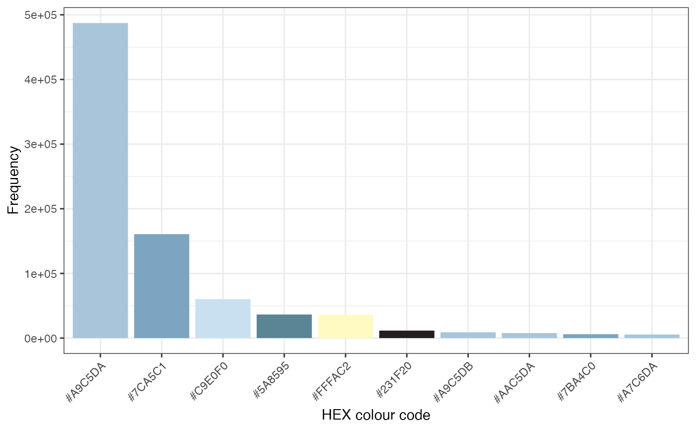
Average top colours
In Figure 3, we can see that there are a lot of similar colours. That
is, many of the colours are different shades of a metallic blue. By
setting avgCols = TRUE, we can group together colours with
similar shades into \(n\) groups via
the n_clusters argument and average over them to produce a
single colour. In this case, we are setting n_clusters = 5
(this eliminates the need to set the n argument).
set.seed(1701) # for reproducability

top10avg <- getTopCol(path = "https://raw.githubusercontent.com/AlanInglis/colouR/master/images/bender.png",
                      avgCols = TRUE,
                      exclude = TRUE,
                      n_clusters = 5)
# order factors
top10avg$avg_color <- factor(top10avg$avg_color, levels = top10avg$avg_color)

# plot
ggplot(top10avg, aes(x = avg_color, y = freq)) +
  geom_bar(stat = 'identity', fill = top10avg$avg_color) +
  theme_bw() +
  theme(axis.text.x = element_text(angle = 45, hjust = 1)) +
  xlab('Average colour') +
  ylab('Frequency')
Excude custom colours
In Figure 4, we can see that several black shade have slipped through
the exclude filter. However, we can provide additional hex
codes by passing them to the excludeCols argument. To
illustrate this point, we will use the previously created dataframe of
top 10 colours, with the inbuilt black and white shades removed.
Examining the colours we have:
top10exclude
#>        hex   freq col_percent
#> 2  #A9C5DA 487309     13.2896
#> 3  #7CA5C1 160750      4.3839
#> 4  #C9E0F0  60288      1.6441
#> 5  #5A8595  36473      0.9947
#> 6  #FFFAC2  36049      0.9831
#> 7  #231F20  11566      0.3154
#> 8  #A9C5DB   8923      0.2433
#> 9  #AAC5DA   7807      0.2129
#> 10 #7BA4C0   6042      0.1648
#> 11 #A7C6DA   5520      0.1505
However, if we want to exclude any of these colours, we can pass them
as a character vector of hex values to the customExclude
argument, as follows:
coloursToExclude <- c("#A9C5DA", "#7CA5C1", "#C9E0F0", "#5A8595", "#FFFAC2")

top10exclude <- getTopCol(path = "https://raw.githubusercontent.com/AlanInglis/colouR/master/images/bender.png",
                          n = 10,
                          avgCols = FALSE,
                          exclude = TRUE,
                          customExclude = coloursToExclude)
Now when we look at the top10exclude object, it should
not contain any of the colours selected.
top10exclude
#>        hex  freq col_percent
#> 7  #231F20 11566      0.3154
#> 8  #A9C5DB  8923      0.2433
#> 9  #AAC5DA  7807      0.2129
#> 10 #7BA4C0  6042      0.1648
#> 11 #A7C6DA  5520      0.1505
#> 12 #A7C6DB  5496      0.1499
#> 13 #7AA6C1  4933      0.1345
#> 14 #AAC5D8  4731      0.1290
#> 15 #7AA6C3  4524      0.1234
#> 16 #A8C4D9  4467      0.1218
Grouping colours
As we have already seen, in colouR we provide an option
to group and average colours in the getTopCol function. The
function used to group the colours is the groupCols
function. This function takes a vector of hex color values and converts
them to the RGB colour space. It then groups them into
n_clusters using k-means clustering. For example, if we
take a vector of colours like the one below, we can see that there are
some unique colours and some colours that are similar. To begin, lets
take a look at the colour palette, we can do this by using the
plotPalette function:
hex_colors <- c("#FF0000", "#00FF00", "#0000FF", "#FFFF00", "#FF00FF", "#1050FF", "#ffff50")

plotPalette(hex_colors)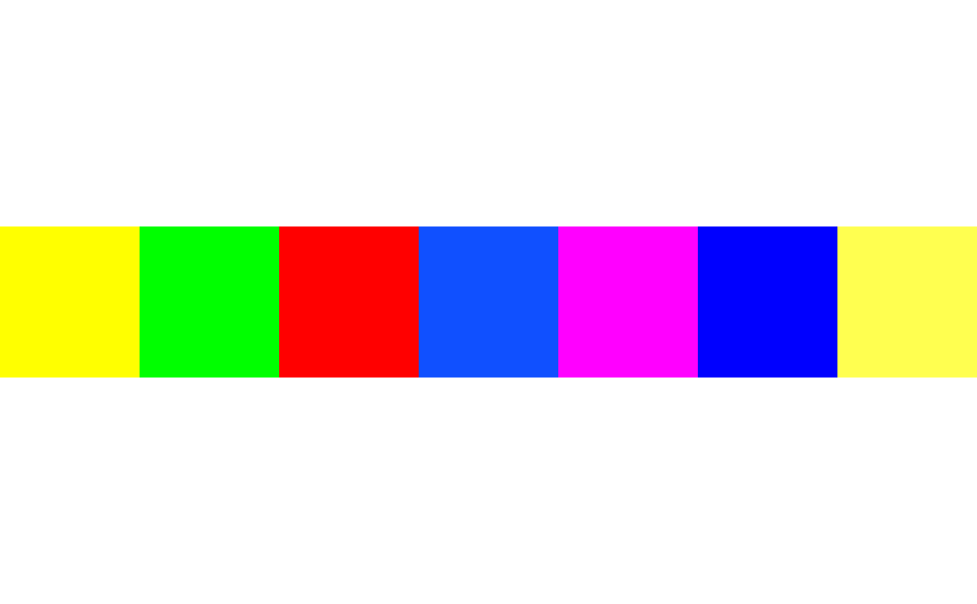
To group the colours into, say, 4 groups we set
n_clusters = 4. The output is a data frame with two
columns. One containing the hex value and another containing the group
number.
cols <- c("#FF0000", "#00FF00", "#0000FF", "#FFFF00", "#FF00FF", "#1050FF", "#ffff50")

set.seed(1701) # for reproducability
grCol <- groupCols(hex_colors = cols, n_clusters = 4)
Plot Groups
Arranging the data frame by group and plotting gives us:
# order factors
grCol$hex_color <- factor(grCol$hex_color, levels = grCol$hex_color)

# plot
ggplot(grCol, aes(x = hex_color, y = group)) +
  geom_bar(stat = 'identity', fill = grCol$hex_color) +
  theme_bw() +
  theme(axis.text.x = element_text(angle = 45, hjust = 1)) +
  xlab('Average colour') +
  ylab('Group')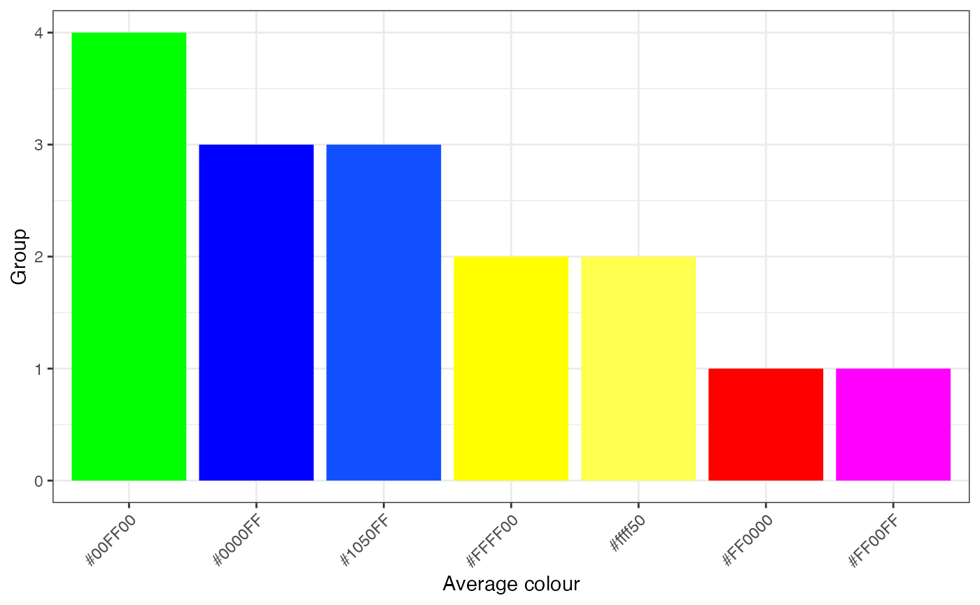
or using the plotPalette function:
plotPalette(df = grCol, color_col = 'hex_color')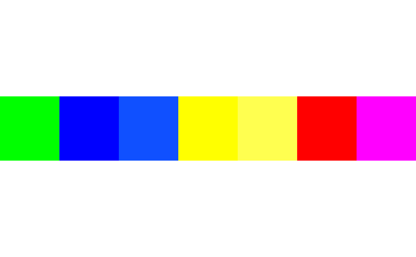
We can see that the green colour is in a single group, the two blue colours are grouped together, along with the two yellow colours. The red and violet colours are also in a group.
Average colours
The avgHex function takes a data frame with two columns:
one for the hex color values and another for the group labels. It
calculates the average color for each group and returns a data frame
with the group labels and their corresponding average hex colors. Using
the grouped colours from before we get:
set.seed(1701)
avgCl <- avgHex(df = grCol, group_col = 'group', hex_col = 'hex_color')
avgCl
#>   group avg_color freq
#> 1     1   #FF007F    2
#> 2     2   #FFFF28    2
#> 3     3   #0828FF    2
#> 4     4   #00FF00    1
plotPalette(df = avgCl, color_col = 'avg_color')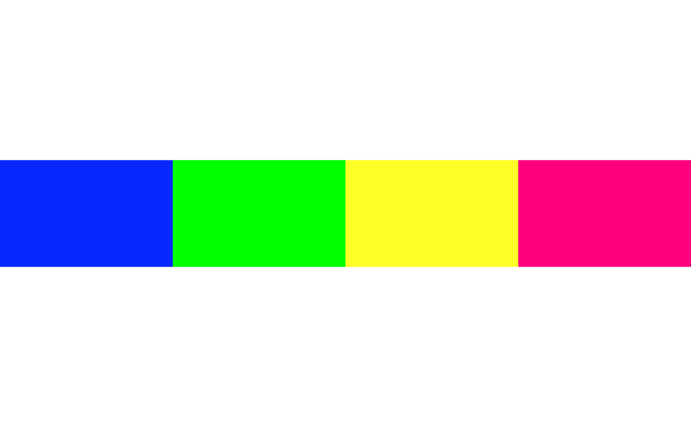
In Figure 8, we can see that the four groups have been averaged into single colours.
Build Colour Palette from Image
The img2pal function automates some of the above
processes and creates a custom palette, ready to use, directly from an
input image. The function arguments mirror those from the
gettpCol function. In the example below, we are creating a
colour palette of the top 10 most frequent colours, while grouping into
15 clusters and averaging the colours. Using the same image of Bender
from above, we can do the following:
pal <- img2pal(path = "https://raw.githubusercontent.com/AlanInglis/colouR/master/images/bender.png",
               n = 10,
               avgCols = TRUE,
               exclude = TRUE,
               n_clusters = 15,
               customExclude = NULL)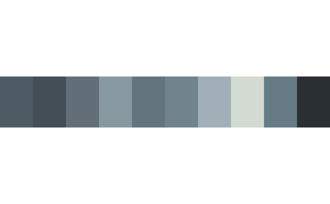
And we can take a look at the hex codes for the colour palette by
checking the newly created palopbject:
pal
#>  [1] "#8898A0" "#64747F" "#D3DAD1" "#2A2F34" "#434E56" "#A0AFB8" "#667B86"
#>  [8] "#4D5C64" "#71838D" "#636F78"
Prebuilt Palettes
One useful feature of taking in an image and return the top \(n\) colours is the ability to turn that
image into a colour palette. For fun, we provide colour palettes based
on all the studio albums of both Radiohead and Taylor Swift. The
palettes can be accessed by indexing either
radiohead_palettes or taylor_palettes, as
shown in the code below. It should be noted, that when creating these
custom palettes, the top 10 average colours were chosen.
Radiohead
The full list of names for Radiohead are:
-
pabloHoney: Pablo Honey -
Bends: The Bends -
okComputer: OK Computer -
KID_A: Kid A -
Amnesiac: Amnesiac -
httt: Hail to the Theif -
inRainbows: In Rainbows -
tkol: The King of Limbs -
amsp: A Moon Shaped Pool
Taylor Swift
The full list of names for Taylor Swift are:
-
tSwift: Taylor Swift -
fearless: Fearless -
speakNow: Speak Now -
red: Red -
1989: 1989 -
reputation: Reputation -
lover: Lover -
folklore: Folklore -
evermore: Evermore -
midnights: Midnights
radiohead_palettes$pabloHoney
#>  [1] "#D9BE9C" "#C8751E" "#2C2372" "#EAE1D5" "#E8B559" "#7E8B42" "#39251A"
#>  [8] "#EAA41C" "#D7478C" "#A7381F"
taylor_palettes$red
#>  [1] "#694B4B" "#C0B6A4" "#4E3843" "#7F675A" "#AB5862" "#95806D" "#9B2E47"
#>  [8] "#A99783" "#EDE6DA" "#30263A"
Palette Plots
To view any of the palettes, we can use the plotPalette
function:
plotPalette(radiohead_palettes$okComputer)
plotPalette(taylor_palettes$red)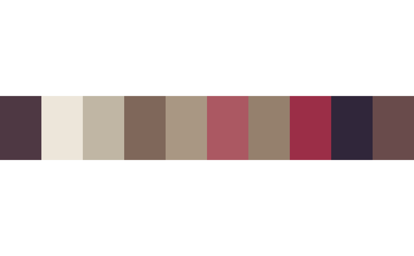
Additionally, to create a larger colour palette we provide the
colPalette function. This function generates a custom color
palette based on the specified palette name. The color
palettes are sourced from two predefined lists:
taylor_palettes and radiohead_palettes. For
example
# Create a color palette based on a Taylor Swift album cover
tswift_palette <- colPalette(palette = "evermore")
tpal <- tswift_palette(20)
plotPalette(tpal)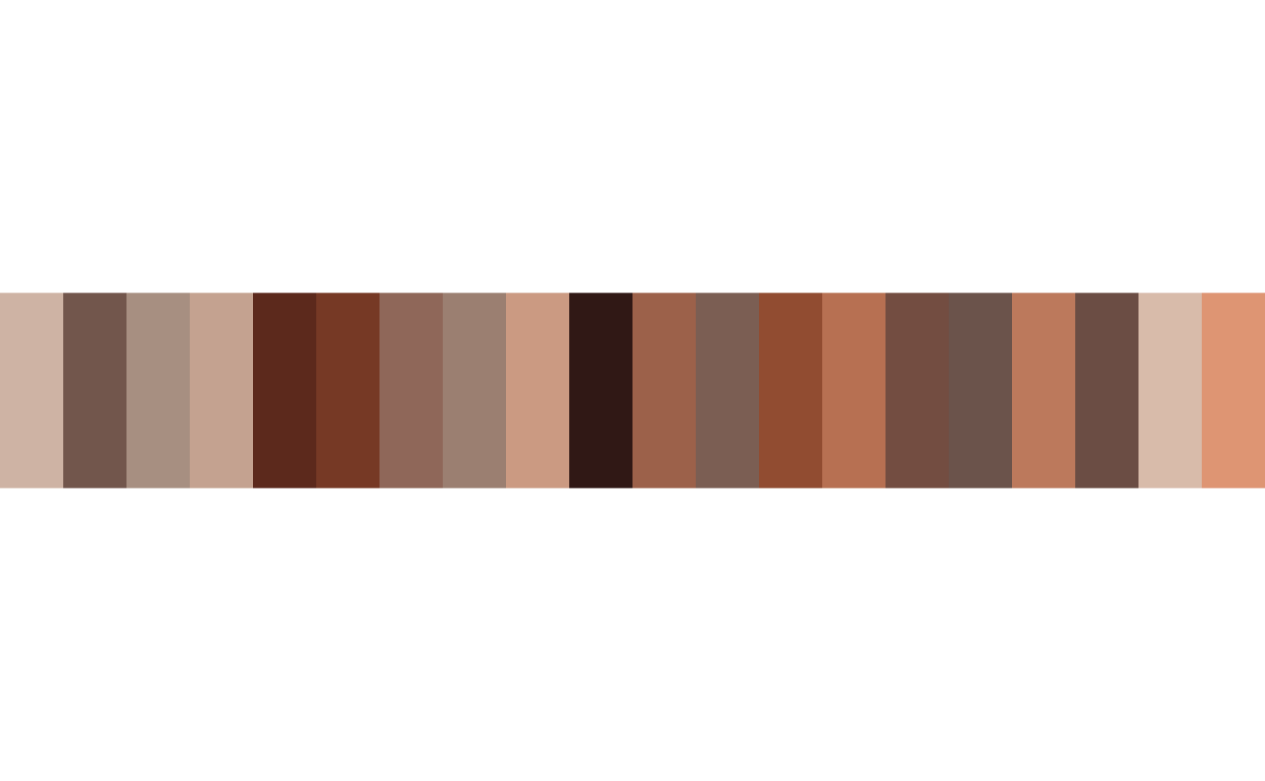
Use in ggplot
For convenience, we also provide functionality to use these palettes
as either a scale fill or scale colour (similar to the
ggplot2 scale_color and
scale_fill functions).
library(dplyr)
#>
#> Attaching package: 'dplyr'
#> The following objects are masked from 'package:stats':
#>
#>     filter, lag
#> The following objects are masked from 'package:base':
#>
#>     intersect, setdiff, setequal, union
# Apply a Radiohead color scale to a ggplot2 plot

# Create a summary data frame with counts per manufacturer for the mpg data
manufacturer_counts <- mpg %>%
  group_by(manufacturer) %>%
  summarize(count = n())

# sort the data
mpgsort <- manufacturer_counts[order(manufacturer_counts$count, decreasing = TRUE), ]

# order factors
mpgsort$manufacturer <-  factor(mpgsort$manufacturer, levels = mpgsort$manufacturer)

# Create the plot using a Radiohead palette
ggplot(mpgsort, aes(x = manufacturer, y= count, fill = manufacturer)) +
  geom_bar(stat = 'identity') +
  theme_minimal() +
  theme(axis.text.x = element_text(angle = 45, hjust = 1)) +
  scaleFill(palette = "pabloHoney", guide = "none")
scaleFill.
To do the same using a Taylor Swift palette:
# Create the plot using a Taylor Swift palette
ggplot(mpgsort, aes(x = manufacturer, y= count, fill = manufacturer)) +
  geom_bar(stat = 'identity') +
  theme_minimal() +
  theme(axis.text.x = element_text(angle = 45, hjust = 1)) +
  scaleFill(palette = "evermore", guide = "none")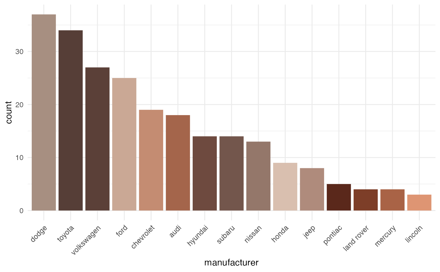
scaleFill.
Similarly, to use scaleColor:
# Create the plot using a Radiohead palette
ggplot(mpg[1:122,],  aes(x = displ, y = cty, color = manufacturer)) +
  geom_point(size = 2) +
  scaleColor(palette = 'tkol') +
  theme_minimal()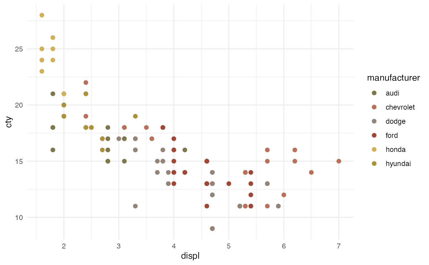
scaleColor.
And using a Taylor Swift palette:
# Create the plot using a Taylor Swift palette
ggplot(mpg[1:122,],  aes(x = displ, y = cty, color = manufacturer)) +
  geom_point(size = 2) +
  scaleColor(palette = 'tSwift') +
  theme_minimal()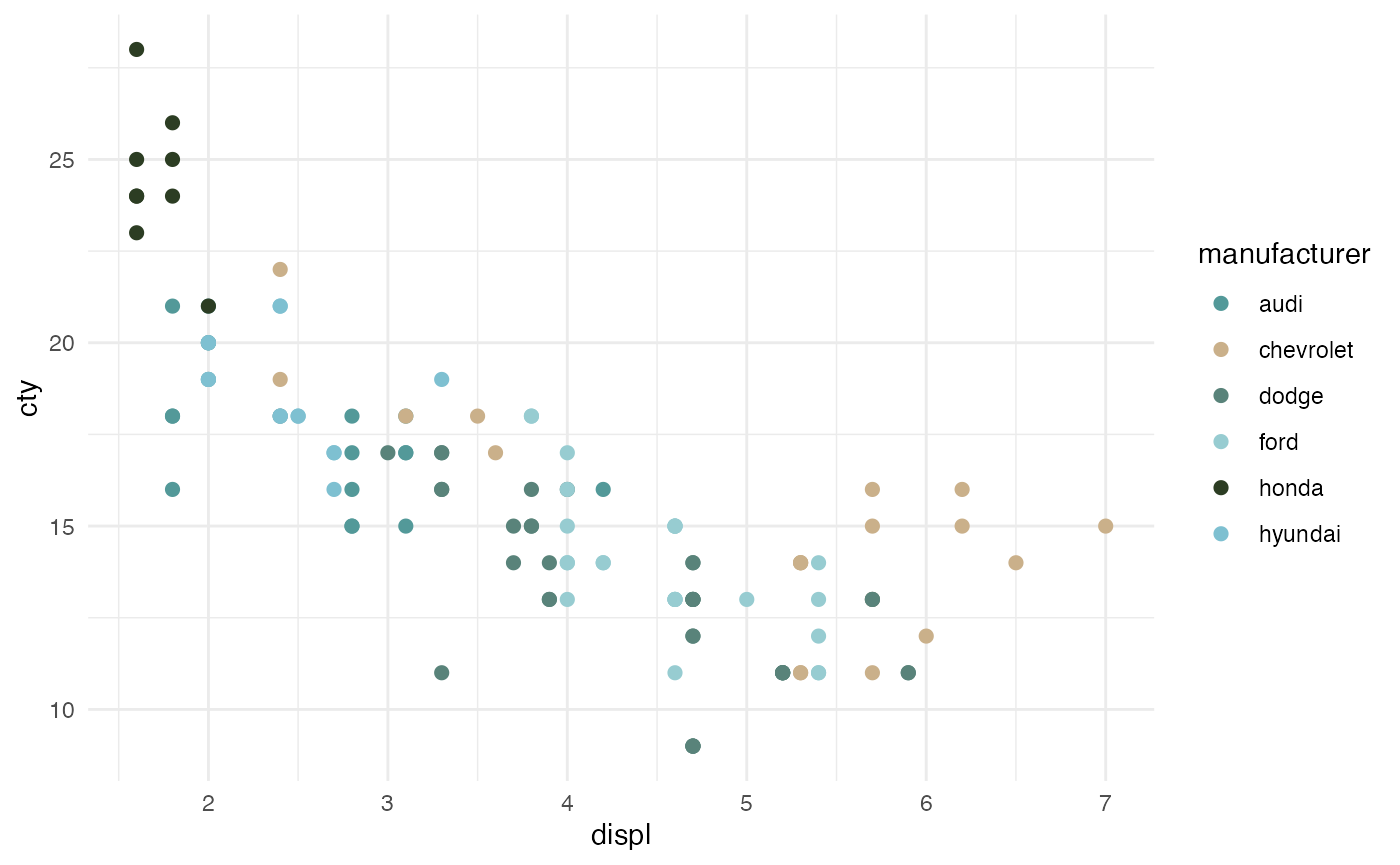
scaleColor.
Of course, we can use these palettes in a more traditional way by passing the palette to ggplot. For example:
# Dummy data
x <- LETTERS[1:20]
y <- paste0("var", seq(1,20))
data <- expand.grid(X=x, Y=y)
data$Z <- runif(400, 0, 5)

# Set a Taylor Swift palette of two colours
pal <- taylor_palettes$tSwift[c(6,5)]

# Create a heatmap
ggplot(data, aes(x = X, y = Y)) +
  geom_tile(aes(fill = Z)) +
  scale_fill_gradientn(
    colors = pal,  name = "Z value",
    guide = guide_colorbar(
      order = 1,
      frame.colour = "black",
      ticks.colour = "black"
    ), oob = scales::squish
  ) +
  xlab('') + ylab('') +
  theme_bw()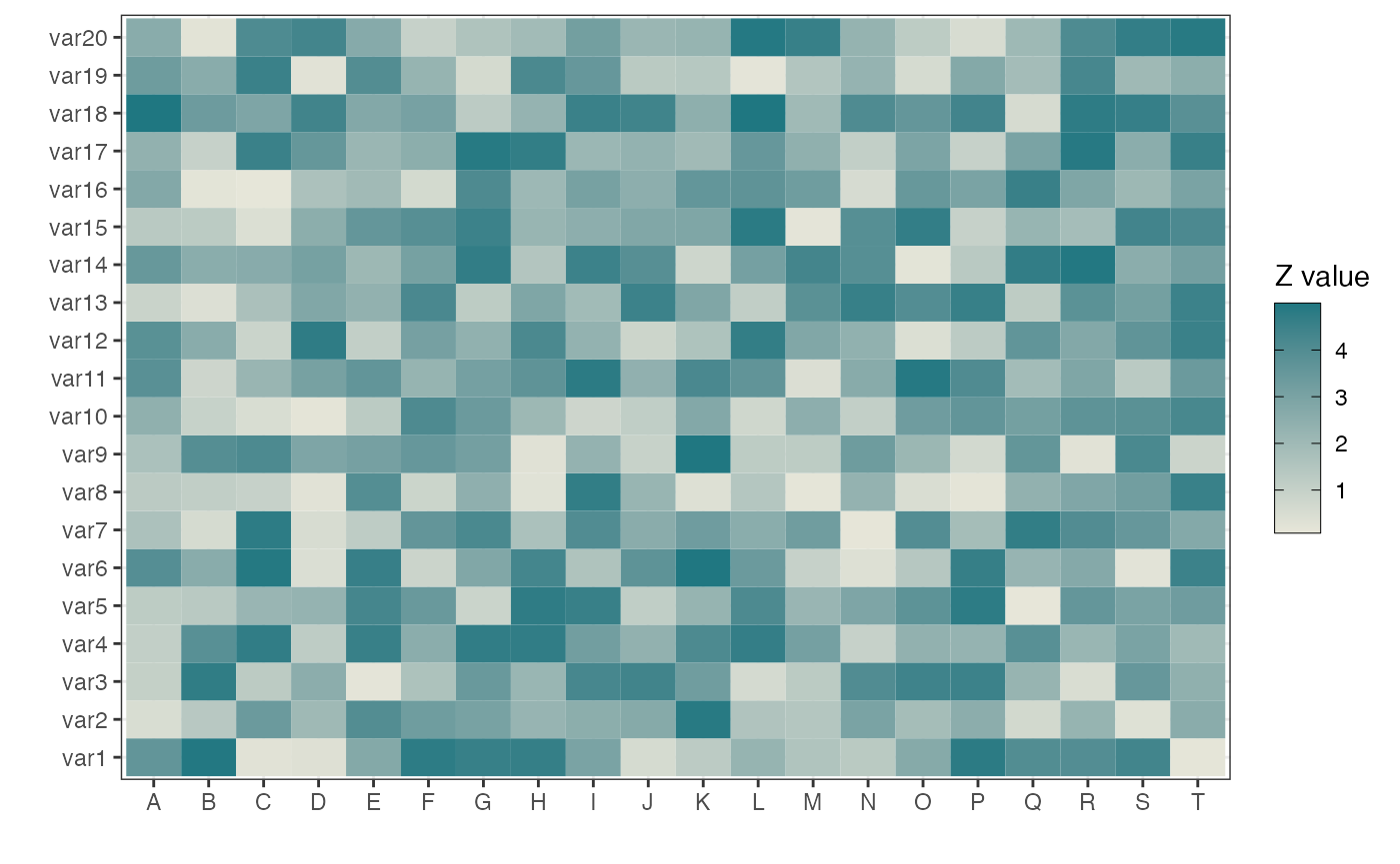
Utility Functions
In this section we take a brief look at some of the utility functions
used in colouR. Thes include a useful little function that
returns the file extension of a given file. For example:
fileName <- "https://raw.githubusercontent.com/AlanInglis/colouR/master/images/bender.png"
getExtension(file = fileName)
#> [1] "png"

# another example
getExtension(file = "example.txt")
#> [1] "txt"
We can see that the returned values are .png and .txt, respectivley.
Additionally, we provide a function that reads an image file (PNG or
JPG) from a URL and returns the image data. This is done via the
read_image_from_url function. It returns an object
containing the image data. If the image is a JPG, the object will be of
class “array”. If the image is a PNG, the object will be of class
“matrix”.
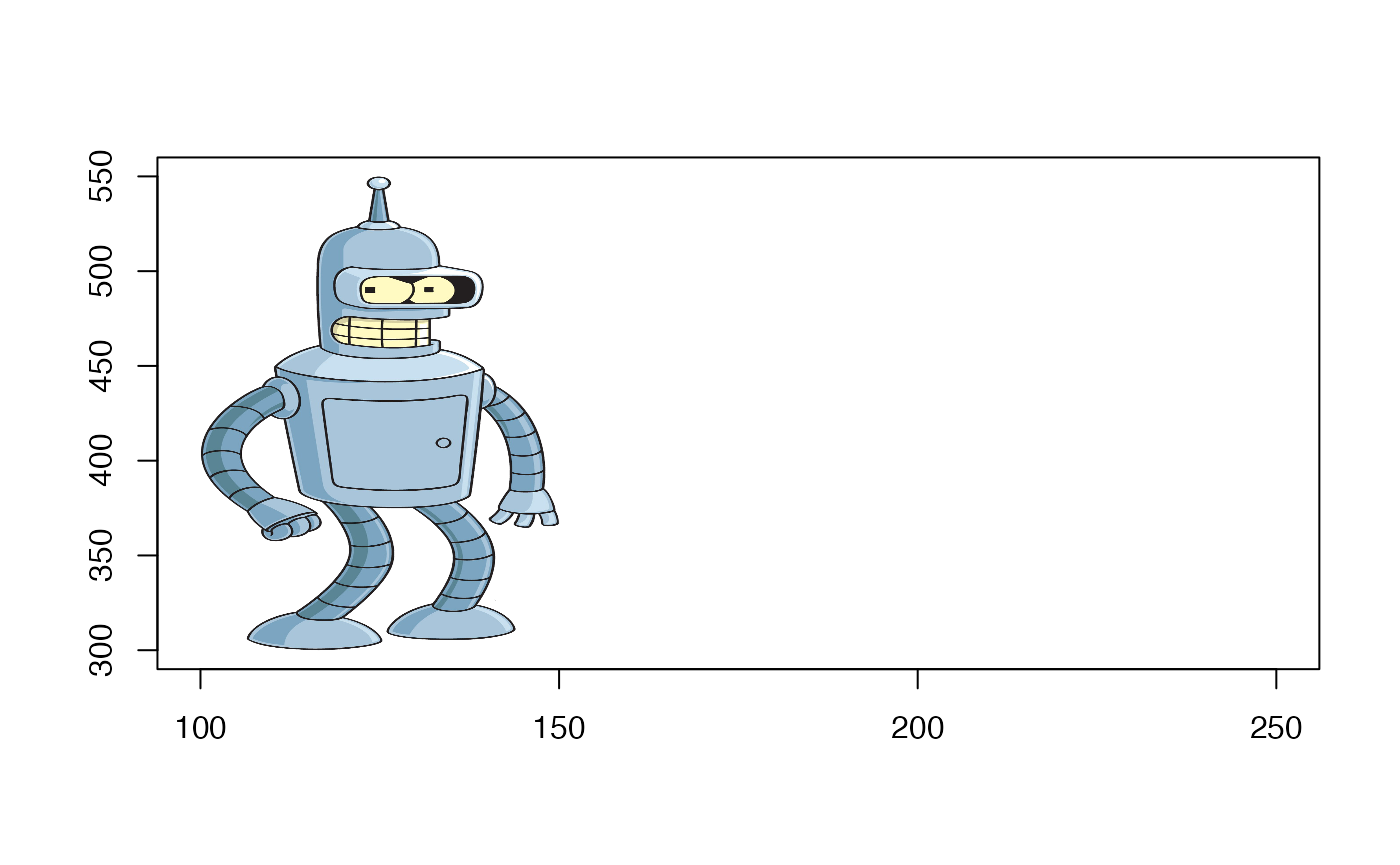
Using the image of Bender from before we can get the image data. The resulting object can then be used, for example:
urlName <- "https://raw.githubusercontent.com/AlanInglis/colouR/master/images/bender.png"
image <- read_image_from_url(path = urlName)

# set up a plot
plot(c(100, 250), c(300, 550), type = "n", xlab = "", ylab = "")
rasterImage(image,100,300,150,550)